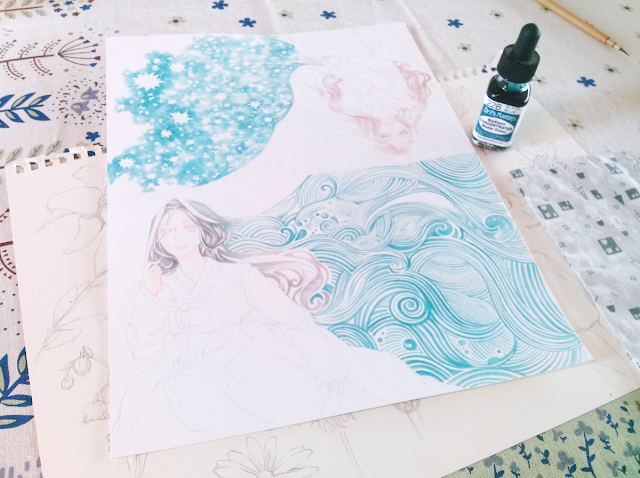
Last week's blog post and speed drawing video were focused on creating the illustration's outlines, in this case pencil. Now we'll move on to the first layers of color and the background pattern.
I often start with a general layer of color for the skin. I'll later adjust it to fit the other colors by adding shadows in different hues, but for the beginning, I keep to a simple mix of yellow and pink.
I knew what colors I wanted to use for the clothes and the wave pattern, but wasn't sure what mix of colors would fit the character's hair. As she's an original character from a story I'm writing, I had her look defined in text but never in an actual drawing. Black hair, as she's supposed to have, would look to stark against the soft colors I wanted to use, so I started of by mixing warm gray, cool gray and brown.
When mixing, I only create a very small amount of color at a time. Thus, after every other brush stroke, the shade and hue would be slightly different, which made for a nice gradient effect and brought variety to what otherwise could be a boring hair color.
Moving on to the focal point of the image, the wave pattern!
As this illustration has a counterpart with a star pattern, I wanted to keep the two designs in the same shade. I chose a specific color, Slate Blue, and proceeded without mixing. I did however vary the ratio of water to pigment and layered the color more thickly in some areas to keep it from looking too bland.
Most relaxing part of any drawing, ever.
The general color scheme is, as you can see, reddish browns with lots of blue. The complementary color for blue would be orange, but I didn't dare go there with the color mixing, and stayed in my comfort zone with brown and red.
Materials and colors used:
Dr.Ph.Martin's Radiant Concentrated Water Color
Sunrise Pink
Ice Yellow
Mahogany
Ice Blue
Slate Blue
Sepia
Iris Blue
Dr.Ph.Martin's Synchromatic Transparent Water Color
Payne's Gray
Medium Gray
+ Lots of water
Brushes:
Watercolor brushes by a Korean no-name brand (wooden handel, rough but not stiff bristles)
Next week will feature color layering, details, more details and some colored pencil accents!


Oh my goodness! That final product (first picture) is absolutely gorgeous!
ReplyDeleteThank you so much! I'm happy with the result myself (what a rare thing for an artist to say, haha)
Delete