20 December 2015

Review: Innisfree Creammellow Lipstick in #3 Cream Coral

One last review before the holidays roll around with full force!

Most of my Korean makeup reviews are focused on lip products - I just love lipsticks, lip tints and lip anythings. They are quite easy to review, too. Skincare and base makeup is much more dependant on individual skin and kind of hard to review, especially for someone like me who has no idea about ingredients... But if anyone is interested in reviews for other makeup products, or haul/mini-review posts, that would be something to dab my toes into in the new year!

Korean makeup Kbeauty lipproduct review swatch
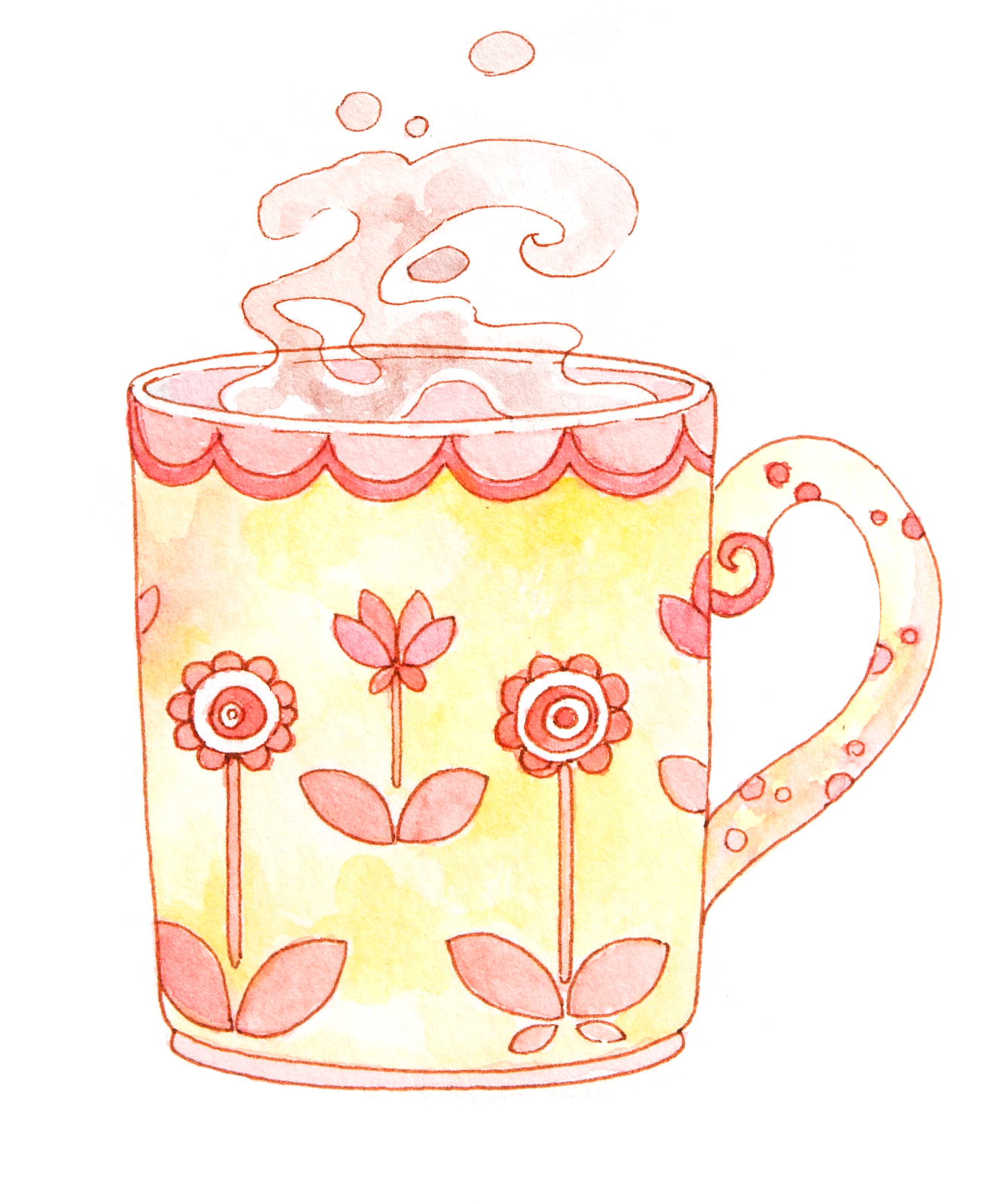
I did smuggle the lipstick on my last flatlay illustration, though!
I'd wanted to review my Innisfree Cream Mellow Lipstick in #3 Cream Coral in my last post on my Korean Winter Makeup Favorites, but that monstrosity of a review post got a bit too long for comfort. Also, this color is more of an all-year-round favorit of mine, as it's a very natural, light coral hue that goes very well with daily, natural makeup.

The Creammellow Lipstick came out in autumn 2014. 

Innisfree has been releasing autumn lipstick ranges steadily over the last three years, with the Color Glow range in 2013, the Creammellow in 2014 and now the Real Fit Lipstick in 2015. I still have to try the Real Fit line - I couldn't decide on a color in store and I'm kinda on a no-buy for the moment. 

A kind warning: On the official Korean innisfree page, the Color Glow range is nowhere to be found right now. It's possible that they removed the line now that they came out with the Real Fit line - which is a shame, because I love the formulation of the Color Glow lipsticks! 

Korean Makeup Review Product Photography Detail

The packaging is similar to the innisfree Color Glow Lipsticks, but with an elegant touch thanks to the rose gold accents. The color is indicated on the end of the lipstick, which makes it easy to find shades amongst a frankly huge collection of similar designs. :')

Kbeauty Korean Makeup Review Product Image Lipstick


The lipstick bullet had a pretty diamond shape in the beginning, though I've used it way too often for that to still be visible.


Korean Makeup Review Lip Product Swatch
Left: One layer, no reflective light
Right: One layer and reflecting light (all shiny and pretty)

As for the shade: 
I've got the same lipstick in red (#8), as well, and was positively surprised that the pigmentation was as spectacular for the less-saturated shade #3.

Nudes and I don't go well together. As soon as there's hints of beige in any lipstick shade, it washes me out. I was a bit hesitant before getting this color, swayed into the direction of my usual bright oranges, reds and fuchsias. But in the end, the shade won me over when swatching in the store: It's a really nice mix of different hues, with hints of coral, warm undertones and an overall milky finish without leaning into beige territory.

Here's the total shade selection:


I hope you can understand my anxiety over which shades to choose... I've got #3 and #8 and love them both. Now I'm here, eyeing #5 or #6 (or #9) because of all the pretty. 

If warm hues don't suit you, #2 would be a good alternative! #1 was too pale for me in store lighting, but probably would go well with a smokey eye. 

One or two layers are enough for getting the shade indicated on the lipstick packaging, and for a shade as light as this it covers the lips really well! (I've got a small freckle on my lips that I use for determining lipstick coverage, if that's even a thing.)

The name is a bit misleading, though. For something that's called 'Cream Coral', the color leans a bit more towards a warm pink than a true coral. It looks more coral-orangey when swatched on my hands compared to later on the lips. So if you're not into pinks, be warned!


Korean Makeup KBeauty Product Lip Swatches

The Cream Mellow Lipsticks have a very, well, creamy texture. This means they're moisturizing and very forgiving on dry, even chapped lips. I really like the texture when my lips are in a terrible condition, because these lipsticks actually hide my dry flakes.
They do feel slightly sticky in the beginning due to their glossy finish.

(You can compare the swatches of the Cream Mellow Lipstick with the Innisfree Color Glow Lipstick - the Cream Mellow ones are more moisturizing and a bit 'heavier' on the lips.)

Kbeauty Korean Makeup Review


For skin references, I'm a Innisfree Waterglow Cushion #13 (or #13 for just about anything) or Espoir 'Porcelain'. So if you're a darker shade, this could actually be way less bright in contrast with your skin and really function well as a kinda-pale-nudeish lipstick. 

Now, when I look at this on my lips, it does remind me of the Innisfree Real Fluid Rouge liquid lipstick which I've got in a similar shade. The difference lies in the finish: The liquid lipstick is much stickier, glossier and oilier, where the Cream Mellow Lipsticks adhere to the lips closely while still being moisturising and shiny.

 If I'm torn between the two on any given day, I'd choose the Cream Mellow for busy days where I won't be able to touch up, as it fades slowly and prettily, without clinging to odd spots. 
The Real Fluid Rouge is gone much more quickly, leaving behind only the slightest tint of pink, so it's a bit more high-maintenance (though even MORE forgiving on abused, chapped winter lips...)

Dopey faces, here we go. I'm getting used to seeing pictures of myself,
which was kind of the whole point for starting these. (I really, really hated pictures......)

What I really like about this shade is its versatility. It goes well with a bare face, just adding a hint of color to the lips: Just some dabs with the lipstick, and then lip balm on top. It's a go-to shade for natural 'no makeup' looks for me.

But whenever I actually do something with my eyes that involves more than tightlining, this color is still muted enough to not overpower heavy eye makeup. Kind of a fool-proof lipstick.


So, long story short:

- very moisturizing
- perfect for chapped, dry lips
- versatile color
- fades prettily
- can be applied inprecisely without looking terrible (no lip brush required - I can even use this one without a mirror!)
- good pigmentation
- warm undertone

It retails for 12,000 Won, and is well worth that money in my opinion, though I'm still waiting for a 1+1 or good ol' sale to grab some more. They won't run away.

That's it! I hope you find something that suits your skintone and preferences in the color selection they've got available! I want them all! :D

Check out my review for shade #8 Moist Dewy Red Creammellow Lipstick, too.

10 December 2015

Creams, Flowers and Spices - Korean Makeup Winter Favorites

Winter Favorites - Korean Makeup, Chai and Spices!


Winter is here, and I did some major overhauling when it comes to skincare and makeup. I'd used up most of my summer products anyway, so skincare changes were a no-brainer towards heavier, moisturizing products.

Edit 2017.02.09 : This post contains affiliate links (additionally marked with an * asterisk in the blog post), meaning I will make a small commission from anything you buy. View my 'About' page for the full disclaimer and my review policy! All products are purchased by me.

On the makeup front, I'm into creams and reds. 'Dry Flower' makeup was quite popular in Korea this autumn, and I love the muted colors to be found everywhere thanks to that trend.

Mamonde Innisfree Skincare Asianbeauty Korean Makeup Flowers Chai Tea Spices

Instead of flatlay photography, I'm into flatlay illustrations!

I love trying out new ways to present makeup in drawings, and this looks promising to me, especially since I can combine the products themselves with other elements like flowers and, in this case, spices.

FAVORITE DRINK


It wouldn't be winter without chai tea! I love chai tea of all kinds, but haven't yet found the perfect mix... if anyone has a suggestion on what to buy, or even a recipe, that would be great!

SKINCARE FAVORITE


The Innisfree Ginger Oil Rich Serum has been a wonderful discovery. I got it with 40% off thanks to a birthday coupon, which makes this pricey item affordable (though I'm already debating if this would be worth to repurchase at full price...)

As the name suggests, this is a serum - but it's on the heavier, moisturizing side. I've got the 'Rich' version, but there's also a normal version (Innisfree Ginger Oil Serum (*)) for skin that doesn't need that extra moisture boost. Despite the 'oil' in its name, the serum absorbs quickly and doesn't leave any oily residue. It's been incredibly calming for my skin, made some of the early dry flakes disappear and has the nicest ginger scent.

I'd recommend this for people living in dry winter climates with a dry, dehydrated skin type. Innisfree is marketing it as a 'Winter Serum' to keep skin healthy during the cold months. I feel like this really locks the moisture in before I even move on to lotions or creams.

Mamonde Innisfree Creamy Tint Lipstick Dry Flower Rose Makeup Beauty Illustration
Trying my hand at flatlays... 

MAKEUP FAVORITES


This time of the year is all about lipsticks for me.

The Innisfree Creammellow Lipsticks from last year are my go-to choices. I've got the #3 크림 코랄 Cream Coral and #8 촉촉 물 먹은 레드 which translates to something like ... glossy, watery red? Check out my two reviews for swatches!

Mamonde has some really nice lip pencils, and the one I've got is perfect for winter: It's the Creamy Tint Color Balm Intense in #16 Velvet Red (*). Swatches below!
Mamonde had an entire collection of 'Dry Flower' inspired makeup products (as they have 'bouquet' inspired collections - they're generally very flowery) featuring all sorts of muted colors for both eyes and lips, and the look was very popular. Youtube and Naver Blogs are full of tutorials on that - mostly the looks are titled something like 'dried rose makeup' or '말린 장미 메이크업'. I've added my own look and review for two of their shades.

Then, there's the Innisfree Creamy Tint Lipstick in #5 (*) which is called 'Midsummer Sunshine Red'. I know. Summer. But it's such a nice, matte red shade that isn't too over-the-top for daily wear (swatches below)! It stays on forever and I find it quite fitting to not only summery bright days, but autumn foliage and Christmas decorations. So sue me, this is my winter choice.

Kbeauty Kmakeup Kstyle Makeup Flatlay Innisfree Koreanmakeup Favorites

The one right there. By accident, I put a sticker on it that doesn't really fit... Wanted to put that VDL lipstick sticker on an actual VDL lipstick case, but it wouldn't show up on the black background, so I quickly grabbed the closest lipstick and put it there.

Innisfree Makeup KBeauty Review Beautyblog Creamytint lipstick Redlips

For base makeup, I'm back to my trusty Waterglow Cushion in #13. I'm already too pale for the Mamonde Moisture Mask Cushion I showed you in my last review.

Kbeauty Swatches Innisfree Korean Makeup Beautyblog
Innisfree Gel Liner #8


All Time Favorite Korean Eyeliners: The Innisfree Gel Liner

A creamy and subdued eyeliner choice is the Innisfree Gel Liner #8 (*) 작은 나무 그네 which translates into something along the lines of 'swing on a small tree' or 'small wooden swing' - no idea why they went with that title, but really, it's a nice brown color that doesn't lean too bronze or glittery. Very subtle eyeliner - I use it quite thickly and blend it out a bit, it works like a creamy eye shadow! But doesn't budge after it dried, so you gotta blend quickly. Also a really nice choice for the under eye area.

These Gel Liners are my favorites since - unlike most other brands I've tried - they never dry out or get scratchy.

Innisfree Mamonde Lip Crayon Korean Makeup Beauty KBeauty KStyle Illustration Watercolor Evelyne Park evydraws

As for swatches:

Review KMakeup KStyle KBeauty Korean Innisfree Mamonde Lipstick Redlips Swatch
Swatches for my current favorites! 

On the left: Mamonde Creamy Tint Color Balm Intense #16 Velvet Red

Middle: Innisfree Creamy Tint Lipstick in #5 Summer Sunshine Red
(so confusing how both products have 'creamy tint' in their name!

And to the very right, the Innisfree Gel Eyeliner in #8. 

Mamonde Korean Makeup Lipstick Lip Crayon Favorite Lipswatch Review

The shade #16 Velvet Red is quite famous in the Korean Bloggersphere for being a dupe for the Nars lip pencil (in the shade 'Dolce Vita' if I'm informed correctly) but as I've never tried anything from Nars, I can't attest to that. 
I can say that I love the slight brick-red undertone, the semi-matte finish (it looks way more glossy in the photo, it's more of a matte finish in reality) and its long-lasting power! This stays on my lips even through drinking and eating, though it doesn't stain like a lip tint would. Just 'sticks' where it's supposed to be. Also really forgiving when it comes to sinking into lip lines, as long as you keep them really well moisturized before applying. 

Also, it's got a wonderful Bourbon Vanilla smell. I have to stop myself from taking a bite off the lip crayon every single time. 

Mamonde Lipstick Lip Crayon Korean Makeup KStyle KBeauty Review

Aaand it makes me look kind of like a grown-up...!?


The Innisfree Creamy Tint is a great layering color on top of the Mamonde one! 

In the following swatches I've left the base of #16 Velvet Red untouched, just added a layer of #5 Summer Sunshine Red on the inner parts of my lips. Makes the color pop more without being overbearing.

I have to be really careful with red lips - it can kind of turn me into a clown. So I like to tone down the pure, bright red of the Innisfree #5 with the more muted Mamonde #16.

Gradientlips, Lipstick Korean Makeup KBeauty KStyle Lipswatch

I'm no fan of gradient lips, as in covering up my lip lines with concealer/foundation and only applying color on the inner parts. In all honesty, I've never actually seen anyone wear that look outside of the internet...? Gradient lips that combine two lip colors, though, are so my thing! Endless possibilities and combinations, and feels a lot like painting. :D

Mamonde Dry Flower Makeup Creamy Tint Color Balm Intense #16 Velvet Red Innisfree Creamy Tint Lipstick #5 Sunshine Red Lip Crayon KBeauty KMakeup Korean

Another favorite product I've taken back out from the bottom of my pouch: 
This lip brush by Innisfree! It's retractable and comes in very handy when going for these lipstick-focused looks. Because it's so small, I can even use it on the go~

Korean Makeup Tools Brush Beauty Blog Flatlay

Korean Makeup Beauty Review Beautyblog Flatlay Lipbrush

That's it! My look back on the month of November or the beginning of winter in general.

What are your favorites this time of the year?

Have a great December for now! Cookies and chai tea lattes for everyone!

30 November 2015

NaNoWriMo - An illustrated look at my Novel Writing Month

November is National Novel Writing Month. I hadn't known about that little fact up until last year when I promptly decided to take part in it.

I'm not an author, strictly speaking. I have written, drawn and then gotten published comic books, but never before attempted to tell a story only in writing. So, on to new things!

Of course, I had to draw some character sketches on the by...

In any case, I used November 2014 to get going with a story idea I'd been playing around with for some years. Normally, when doing story concepts for comic books, I'd only write summaries, scene descriptions, portions of important dialogue and character studies before then heading into a detailed script mostly comprised of sketches. This works well enough, but every now and then, plotholes remain uncovered, or something from the beginning doesn't quite add up with the following narrative. And, with the publishing world being what it is and drawing being a run against time, changes become nearly impossible if one doesn't want to redraw the whole book once one reaches the end. Being into whimsical, complicated, sometimes overly crowded storytelling doesn't make it any easier.

So for that particular story idea, I wanted to do it right. I wanted to have the time to edit, to adjust and to polish before even sending the concept to my editor.
Writing came surprisingly easy. Not that it's good writing - but I was surprised at how naturally the scenes I'd imagined drawn came to life with just words. The 50'000 words were over way too fast, and the story only about a quarter done.

I had to focus on some other stories (Lost Ctrl was published in 2015, text editing had to be done, and then I started freelancing as an illustrator and working on a Korean fairytale retelling) but with NaNoWriMo 2015 rolling around, I was ready to dive into that little beast of a story again.

Trying to sort out some timeline issues...
I have some kind of mad scientist approach to story planning.
This is only the mindmap of the second quarter, most of the overall planning was
done back in 2014.
Fantasy is a genre I love, especially if religion, magic and mysticism take a front-row seat. But it's also a genre that's not forgiving to half-hearted worldbuilding and haphazard plots. Writing scenes, plot points and dialogue ahead of bothering with even the roughest of sketches helps me to find my way through the maze of my ideas and to bring them together. Adding in scenes from the point of view of secondary characters helps sort out some inconsistencies I wouldn't have noticed otherwise. Writing action scenes (hopefully) will help me to draw them as more engaging later on.

Hit 50k on day 26 - YAY!

I tried, and managed, to write more than the required 1667 words a day, never slacking off even when ahead of wordcount. As I was quite busy working at the restaurant, drawing commissions and freelancing, I forced myself to only start writing once all of the day's work was done, which often meant 11 pm or later. By that point, I was looking forward to an hour of concentrated writing so much that it was hard to stop myself from just keeping at it all night long. I reined myself in and wrote an average of 2000 words a day.

I can really recommend using writing during NaNoWriMo as a reward after the rest of your to-do list is checked off - it makes writing a treat instead of a chore.

Another character concept illustration I'm still in the middle of drawing...
I did squeeze in some quick character illustrations during October and November (can't quite stop myself from drawing after all...) and am now looking forward to keeping on writing in December. I'll be visiting my family in Switzerland, and as I have neither a scanner nor all my materials over there, the amount of drawing commissions I can do keeps itself in check. Which means: Forced Freedom. Vacation. Time to write during the days, hopefully.


I've got three main characters, three women that grew up in the same temple and have the same name. They were like sisters once, but the story starts years later, when they're all at very different places in life. 
I'm really looking forward to drawing their very different points of view. Especially the viewpoint of the blind priestess will be a challenge when it comes to depicting it.


I'm also experimenting with a more realistic art style mixed with my normal manga style, to fit the more sombre mood of the story I want to create. Maybe something like this? Still struggling.


This would be more typical for me (and easier to keep up over hundreds of pages, mind you), but I'll keep doing style tests until I've finished the script.

Did you participate in NaNoWriMo? Would you like to try? What were your experiences?


20 November 2015

ILLUSTRATION PROJECT : SONG COVER "REFRESH"

Another one!

No, really, I hoped that I would be able to create another album cover in the future after I did the last one, but I wasn't expecting it to happen this fast!

어쩌면 아티스티 is coming out with a new single, and I was asked again to create the illustration for it. Still watercolors, still Jeju-themed, but a bit more playful.


The new single is travel-themed, but more light-hearted than Jeju Baram / Wind of Jeju.

You can take a look (and listen) at a part of the song. It's being used as the promotional song of Jeju Air, so it's been playing on television for a while before it was now officially released by 'Maybe An Artist'.

http://www.melon.com/album/detail.htm?albumId=2651785

And the promotional video for Jeju Air. Someone please give me some money for sharing this.


As for the illustration itself, I was given a free hand and could do whatever I wanted. As the music is playful and light, I wanted to give a similar feel to the drawings and the overall layout. In the end, I went with a grid-layout, reminding of pattern games like tetris or puzzles (I hope haha).

Featuring a selection of individual images that remind me of a, well, refreshing vacation on Jeju - with the famous oranges and clementines giving the color scheme.

These pictures kind of scream to be reused for stickers or post card motives, but I have to hold myself back or I'll single-handedly fund that printing company with all my orders recently.


Actually, I did a lot more illustrations, because I'd originally planned to make the pattern much smaller overall. That turned out to look way too convoluted and even plain unreadable. So here's some of the B-cuts!


Here's some sort of island that could be Sanbangsan, or just good ol' Jeju Island itself.


And of course the traditional houses of Jeju. There's a LOT of these around where I live ('cause I'm a country bumpkin) and they look plain adorable with their red, blue and green roofs.

8 November 2015

MAKEUP ILLUSTRATIONS AND, finally, ARTPRINTS AND STUFF

If you've been following my blog since its creation not too long ago, you may have noticed how my initial 'daily drawings' evolved into makeup sketches and have gotten more detailed and elaborate along the way. Now I've finally gotten around to printing some of my works onto gift cards, textiles, hand mirrors and stickers!

Update 2016: You can find the prints and stickers in my Etsy Shop, too.


From the beginning, I had lots of fun doing these little beauty drawings. I started to use them for makeup reviews and, through this blog and instagram, even got several art commissions!
I wanted to introduce some of these projects to you. I'm experimenting with slightly different art styles for each of them, so hopefully this will be interesting.

First, my collaboration with Bisou Beauty Bar. Bisou is an online store, selling an interesting selection of both high- and low-end Korean brands in Canada.

Since we've started working together, I've created several product illustrations (for the cutest promotions ever??), as well as their business card and additional illustrations like the Pop-Up Shop below.


For these, I tried to make the overall feel of the illustrations more 'professional' - not as cutesy and simple as the ones that I'm using for my own reviews, but still colorful!


Then, I got two Blog Header commissions in short succession. For them to not look similar, they were created with a different atmosphere and, of course, color scheme in mind.


Shia from 'Shiaswelt' contacted me first, and to fit her new blog design I've included soft brown linearts with a mostly rose color palette. While the individual products are quite cute in their packaging, I tried to give the overall illustrations an elegant vibe!

She even uploaded some of the sketches and wips from this project! Way more dilligent than I am myself... haha...

Sooyoona from 'Something Beautiful' was up next, and I worked on both illustrations more or less simultanously. Her color preferences were blues and greens, and as we included not only makeup products, but a variety of other personal favorites of hers, the header became more and more colorful! The result was a playful, vibrant illustration with lots of whimsical details.

Check out both of their blogs to see the header images 'in action' and, of course, have a look at the blogs themselves! It was fun to work with K-Beauty Bloggers from my home country Switzerland and neighboor Germany! :)


So, what now? Now it's time for a little online store!

I really want to pursue this direction with my art. While I love drawing Manga and Children's picture books, and of course have to do my monthly share of bread-winning freelance illustrations, I really enjoy combining my love for drawing, watercolors and makeup!

Now that I'm done with printing, I'm really excited to show you some of the pictures!

I've made a Google Form to function as an online store - it's always been the easiest way to keep orders in one place!


So, I'll mostly do a blog sale here during November (I'll start shipping out items on the 16th, but orders can already be made!), pause during December, and then do the full-scale Etsy launch in January. (edit 2016: Well, it happened in February)


The stickers were made primarly because my cushion cases are old, battered and ugly, and I wanted to decorate them! There's been so many limited editions of cases released this  year in Korea, but I resisted hah...


...I'm really happy with how these turned out! :)


Additional, higher quality images of all products can be found in the order form!


30 October 2015

Creating an Album Cover Illustration - 제주바람 '어쩌면 아티스트'

Hi everyone!

As the last few posts were all beauty-themed, I wanted to shake things up a little with this album jacket illustration I did for the Korean indie singer '어쩌면 아티스트', which translates roughly to 'Maybe an Artist'...! (She surely is one, though!)


The song is called 'Jejubaram', which means 'Wind of Jeju'. As I live on that very island, I was all the happier to create the illustration! It's the perfect music for peaceful traveling (on Jeju or anywhere else), so if you're curious, you can give the song a listen here:

'Jejubaram - Jeju Wind' by Maybe An Artist on iTunes

'Jejubaram - Jeju Wind' by Maybe an Artist on Soribada (only a quick sample there, but hey, for free! ;)

K-Indie is a genre I love listening to on long days in the Cafe, and Maybe An Artist does sing in that lovely, laid-back style I personally really enjoy.


As for the illustration itself:

Jeju Island is famous for its 'Gyul', aka mandarins, oranges and clementines in all kinds of variations. They range from walnut-sized to roughly the size of a large grapefruit and come in all kinds of flavor variations, too! The song's lyrics evoke the scent of mandarins carried by the wind, so the choice of a mandarin tree motive was quite simple! (though we did some other sketches first...)

Some quick studies done during inktober (while traveling to the south of Jeju with my parents) were the basis for the mandarin trees, as well as some pictures I took.

The album illustration was then made with a light pencil drawing as a base, on which I layered watercolors. I didn't want to make the colors too saturated, going for a more 'milky' look. You can have a look at my watercolor collection here - I mostly used Cobalt Green mixed with Cobalt Blue, both giving a slightly muted color. For the mandarins themselves Scarlet Lake, Neapel Yellow and Cadmium Yellow were mixed, and some additional shadows added with Burnt Sienna.

The little sketch I did previously has now been hurled at Photoshop to form this mess:

As I'm currently preparing a lot of little printing projects (stickers, postcards, hand mirrors...) I'll maybe use it as some sort of background pattern. We'll see!


Something like this. Looks kind of christmas-y already, doesn't it?? (...panic!)

I loved working on this simple illustration and hopefully more is to come! As for now, I hope you'll check out 'Maybe An Artist's Instagram or Maybe An Artist's Facebook - she's a lovely person, talented person and deserves more attention! :D


More illustration projects will follow! I'm in the middle of several commissions, some of them spanning months already, and can't wait to share!

Have a lovely weekend and thanks for reading!