Watch me geeking out over little pots of paint.
I really wanted to do this post for a while - it's one of the very reasons I started this blog, actually! I'VE GOT SO MANY THINGS TO SAY ABOUT WATERCOLOR.
Watercolors are my favorite medium. I might prefere pigmented inks for manga illustrations as they are more vibrant, or use colored pencils for realistic shadings, but I'll always come back to watercolors. Often, I mix them with other media, especially with my Dr.Ph.Martin's pigment inks, as they can be kind of overwhelming on their own and clash with each other if I'm not careful. Watercolors are more muted and can make for a more harmonious look.
So, I don't want this to be JUST a long loveletter to watercolors but an actual swatch collections and short review. If you're looking to buy a watercolor set (invest in your future, now!), maybe this can help you in choosing your first colors. Or, if you're already an avid user, you can find some new brands or special colors to add to your collection.
That's my good old case full of colours. It's quite old, as I 'inherited' it from my grandmother (she's alive and well, but she stopped painting some years ago and gave it to me as a gift when I started going to art school) and some of the colors have suffered with time.
All the large pots are from her original case and well over 15 years old.
The small pots are my own additions, bought over the last 7 years (what? where did the time go??) for special colour needs.
The original case is from Talens/Rembrandt and the original colors are from Winsor and Newton. Most of my additional buys are from the same brand for the sake of boredom, though some are from Talens/Rembrandt and Schmincke, as you can see below.
The little blops (?) of color on the right are from art school, where we got to use some tube watercolors - I just added some to my case to save for later. I'm cheap like that. Though a lot of the color blops are from that one time I left the case in the hot Korean summer sun and my colors melted into rainbow sauce.
So many pretty colorssss! Preciousss!
On to swatches!
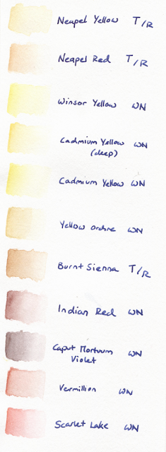
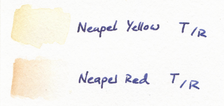
Napel Yellow and Napel Red from Talens were bought when I got started with manga illustrations in watercolor and noticed that Yellow Orchre made for some strange complexions. I mix those two for skin tones, getting warm-yellowish undertones or pinkish undertones depending on the characters. Since I've started using pigmented inks I prefer those for skin colors, though, as the watercolors give a duller result. Now, I use them mostly for skin color shadows and realistic portraits. They are quite hard to build up, as in they don't get much more saturated by layering or using more color-per-drop-of-water.
I didn't like the original Cadmium Yellow in the case, as it gave a bit of a too glaring egg yolk color on paper. So I added the Winsor Yellow and Deep Cadmium Yellow to mix it up. Winsor Yellow mixed with Napel Yellow makes for a really nice blond haircolor base, and the Deep Cadmium Yellow has a warm tone that's more harmonious with other hues than the normal Cadmium Yellow.
As mentioned before, Yellow Orchre was my very first 'skin tone' color. I still use it as a mixing color if I want to make another color 'dirtier'. But since I've bought Burnt Sienna by Talens, Yellow Orchre has kind of just been sitting in my case...
Burnt Sienna is a VERY versatile color. It's color payoff is fabulous (especially compared to the two Napel colors by the same brand, which are hard to get saturated) and the hue is really gorgeous. I use it for skin tone shadows, for hair colors, to warm up and soften other colors by mixing it practically everywhere, and it's also beautiful on its own. If you want to buy just one color by Talens, go with this one! It's an all-rounder.
Indian Red is similar in that it's also an all-rounder that can be mixed well with other colors to give them a reddish hue, and it's easy to saturate. Very useful for nature backgrounds and hair colors, and I really like the effect it gives for skin color shadings (I use it around the eyes of light-skinned characters to give them more depth).
Caput is a strange color. I bought it on a whim because I'd never heard of that shade and it looked reddish-brown but was called Violet. Intrigued!
It's exactly that: A dark brown hue with cool violet undertones. It's actually a nice shading color for brown tones or to mix with blues for a darker, warmer tint, but most of the time I kind of forget I've got this in my case!
Vermillon was there from the beginning, and I really dislike this shade of red. A bit glaring, but not bright, not very easy to layer (it gets duller instead of brighter) and the shade is just not a red fitting my taste. (color snob right here)
Scarlet Lake to the rescue! I bought this pot over my Vermillon frustration, and it's all I wanted. It can go from very light to very bright with just one layer, it's very pigmented, has a cool undertone without going all pinkish on me, and mixes well.
Quinacridone Magenta (a name that just flows of the tongue...), also one of the original colors, is what Vermillon isn't: It's pigmented and easy to layer. Pink is just a color I don't use all that often, so it looks good as new.
Years ago I'd invented a manga character with violet hair, so that's why there's two shades of violet added to the case. I was too lazy to mix, and despite not using them for hair (often...) anymore, I still like these for cool-toned shadows that aren't all-out blue. They may look similar, but as you can see one has cool undertones, one warm undertones, and their pigmentation is also slightly different as they are from different brands. The Mauve shade by Schmincke is smoother, while the Talens' one can get very dark very quickly.
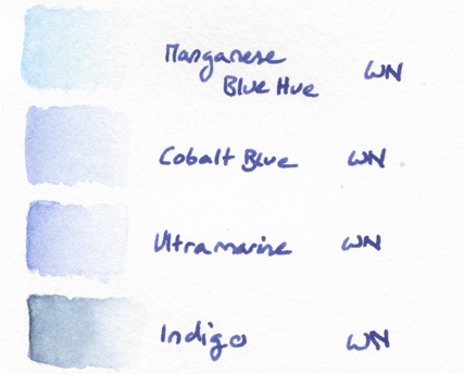
Then there's the quest for the perfect shade of blue. I love blue, it's my favorite color and all, but I'm still not all that happy with the shades I've got here.
Manganese is a very light blue with a mint-undertone that goes well in nearly all color compositions, but it's not very pigmented and you need to use a lot of it to get nice payoff.
The Cobalt Blue is more pigmented and the shade very 'standart', but it's also not very bright. It almost looks a little milky on paper - as if someone had mixed it with white guache. That can work for some illustrations, or look dull in others.
The original blue tones from the case were Ultramarine and Indigo. Ultramarine is the one I use most frequently. It has nice payoff, a flattering shade and mixes well with other colors. It also doesn't have that milky effect and is brighter than Cobalt Blue. But I'd still wish it was even more saturated, more eye-catching! It's just not that beautiful on its own...
Indigo is VERY pigmented. As in, I use one drop of water, let it fall on the color, DON'T STIR and just use the color that comes with the water on its own. The high pigmentation makes it easy to go very dark and saturated and it's a nice color to work with quickly. But it's difficult to get even color payoff as it is so pigmented, and it can look blotchy if you don't mix very well.
I've got a lot of green hues - my grandmother loved painting landscapes, and I was a science illustration student using watercolors for botanical illustrations, so here we are. I adore mint, too, so I've added Cobalt Green and Cobalt Turquoise Light to the collection. They are beautiful shades, but have similar problems like their blue counterparts. Cobalt Green, like Cobalt Blue, has this milky effect that makes it hard to have a bright color for a result. Turquoise Light, similar to Manganese, is not very pigmented and needs to be used with force to get a bright result.
The shade I use most in manga illustrations is Viridian. It's such a nice shade, not a jewel-tone but bright, saturated and with a cool undertone. As it's easier to make a cool color warmer (mixing it with Sienna for example) than to cool down a warm color, I prefer my basics on the cooler spectrum.
Terre Verte Yellow Shade was an impulse buy. It works well for landscapes and botanical illustrations that need to be toned down, but it's all the same a color I don't use that often.
Permanent Sap Green and the Chromium Oxide were the original colors. Permanent Sap Green has a very nice pigmentation - a little goes a long way and it's bright! (almost too bright to be used in botanical illustration, but very effective in my manga illustrations).
Chromium is less saturated and gives a duller result, but it's the color I use more often, actually, as it makes for a beautiful mixer with blue colors!
My darkest shades:
Burnt Umber is a good, basic brown for landscapes, though it isn't the best mixer - I prefer using the Indian Red and Burnt Sienna if I want to darken and 'warm up' other colors, as Umber has a tendency to turn everything into dirt soup.
Also, I have to think of Lord Umber whenever I'm using it, so sadness ensues.
Payne's Gray is my go-to shading color. It gives a very constant color payoff, not too pigmented or milky, so it's easy to work with and mixes well with anything.
Neutral Tint is a tad more tricky, as it has little pigment pieces in the actual pot that act up when mixing, making little spots darker or lighter on a whim. It's not really that noticable, and I actually prefer the hue of this one over Payne's Gray, but if you're mixing, you've gotta be careful if you want a nice gradation.
I DON'T OWN BLACK. I didn't know. My life makes no sense.
That's it! I'll never talk about watercolor shades again. Except if you ask me...
Do you work with watercolors? Do you have a shade or brand to recommend? DO YOU OWN THE PERFECT BLUE?
If you're interested, here's how I work with
watercolors for animal illustrations.
And here's how I used these to
create a botanical illustration.


