29 November 2016

Hanbok Illustration, Korean Traditional Wedding and new Stickers!

I finally managed to update my Etsy shop with motives I'd wanted to create for a long time: Hanbok!


Story time:

For my Korean wedding, I wore a hanbok. We'd decided to buy one instead of going for a rental since there's things like Chuseok and Korean New Year where I can wear it again, (theoretically. It's a pain to put on.) so we wanted good quality and went to this UNBELIEVABLY BEAUTIFUL shop to choose fabrics and cuts and accessories and I still love everything about it.

I've been interested in the different styles, textiles and the historical evolution hanbok went through ever since.

Two of the illustrations are personal: The lavishly embroidered wedding hanbok (that one was on loan, worn on top of normal hanbok) and the simple red-green one which is inspired by what I wore.


Case in point. (And it's so hard to find wedding shots with only me pictured - which sounds very egoistical but hey, I'm trying to protect my family's anonymity :D)

So really, drawing hanboks? Great fun.


There's a total of six ladies, and I decided to make stickers with these because honestly, they're adorable. I have literally no idea what you'd ever need Hanbok stickers for, but who cares?
(worst sales pitch ever)


As always, my stickers are DIY self-cut ones. Since they're larger than my usual stickers, it's surprisingly easy to cut them - and since they're transparent, the occasional hick-up will be invisible anyway.


Size comparison of the original watercolor and ink drawings vs stickers. I really like how the floral patterns for these two turned out!


Two of the Hanbok ladies are available as mirrors in a card format. I chose the Gisaeng (on the right) and the pretty young lady.


The mirrors are made with stickers on a stainless steel surface, so they're sturdy and don't scratch easily - and since they're the same format as credit cards, they should fit into all kinds of purses and mobile phone cases.


Some additional sketches for Hanbok designs. Until now, I've mostly just focused on the Joseon period (which already features a huge variety of designs over the centuries), but since I've started working on a webcomic concept that's set a bit earlier, I'm looking forward to tackling the Goryeo period, too!


I'm also catching up with some Korean historical dramas / Sageuk. For research reasons. Of course. It's strange how I rarely manage to get past the mid-point of modern day dramas, but historical ones? I'll get totally invested. Maybe the themes just appeal to me more.

I didn't manage to get through Moonlight Drawn By Clouds (sketch above) but loved the pretty setting, costumes and the camera angles/lighting choices in the first couple of episodes. My all-time favorite has to be Queen Seon-Duk, Six Flying Dragons aaaand Arang, which is Fantasy but totally counts.

Thank you for reading this super short, very promotion-heavy blog post, but I'm trying to spread the Hanbok love here :) Hope you like the designs, and do tell me if you're into historical K-Dramas!

7 November 2016

ILLUSTRATION: Coloring Books and Printables

Hi everyone!


It's been a while since I've blogged about art projects, and I can actually give a legit excuse for that. Most of the projects I've been working on were coloring books, so I had to keep things quiet until those actually went to print and on sale. (Spoiler: One's out! Yay!) Any other work was... scientific illustrations, complete with NDAs and not really blogging-appropriate aesthetics.

Fun times.
Luckily, Inktober came along to get me out of that nothing-to-show slump!

I'll do a full inktober recap once I've scanned every. single. thing. but for now, here's a focus on coloring pages I created during that month.

You can find free printable coloring cards at the end of this post, so scroll down if you'd like to try those.


But first, I wanted to introduce one of the coloring books I finished recently.

 Amazon Link
Coloring the cover was so much fun because COLORS. 
Created together with Author Francis Keene who came up with the idea of a farmers market themed coloring book, this is by far the cutest coloring book I've worked on! There's a total of 30 pages with illustrations ready for coloring, ranging from detailed looks at spices and teas to an entire market layout.

I can't really show you entire pages, so here's some close-ups!


There's book shops, antique shops...


DIY stalls with crafts ranging from pottery to woven rugs...


FOOD. EVERYWHERE.

Even a stall with Korean street food made it into the book!

I'm really happy with how this one turned out. If you'd like to get a copy of your own and look at the full images, you can order the coloring book "Whimsical Patterns - Farmers Market" on amazon.

I'd love to hear your opinion or see some colored pages!


If you'd like to start small with just single images, I've created two coloring cards you can print yourself:

One was a winter/autumn themed card. I like the idea of a season full of snow and pumpkin spice and soft cardigans, but then the reality of wet shoes, gray days and coldcoldcoldCOLD(!) hits.

The illustration thus shows winter how it should be.


It's a 12.5 cm x 18 cm (5x7 inches) format card that you can print on paper of your choice and color in. Have fun! :D

The second coloring card is all about National Novel Writing Month (which is going on right now and I'm procrastinating by blogging, but hey, I'm on track) - so books, more books and pretty writing utensils.


Same format as the winter card, but there's two options for you to choose from: A black-and-white version and a gray-and-white version. If you'd like to color in something with a softer look, give the gray lines a go.


These printable cards are only temporarily available for free here on the blog - I'll move them to Etsy in December since I want to start offering downloads over there.

Have fun coloring! If you've printed and colored one of these, I'd love to see a picture! Just mention it to me on Instagram (#evydraws or just directly @evydraws), Twitter as evyclocharde or over on Facebook evelynedraws.

My own colored versions will soon be back from the printer, so new textiles, stickers and hand mirrors are on their way!

Thank you for reading and I hope you like the cards and/or book! <3


27 October 2016

Dewy Red - Innisfree Creammellow in #8 Review

Winter is coming (...) and I'm revisiting my old favorites for the colder season. That means lipbalms, the return of facial oils and my Creammellow lipsticks.


I've reviewed shade #3 'Cream Coral' previously but actually bought both at the same time (yay 1+1 sale events). The Creammellow range by Innisfree is perfect for the colder months, with a very moisturizing formula (containing Camellia Oil) that hides my terribly flaky lips.

Red lips~ 
The one I'm reviewing today is my favorite red lipstick, shade #8 Moist Dewy Red.

I've yet to find another Korean lip product that combines strong pigmentation, a neutral red shade and wearable, moisturizing texture (plus affordable pricing...) and believe me, I've been searching.


The Creammellow line was a follow-up to the Color Glow Lipstick by the same brand, sporting a creamier, heavier texture but similar design. Overall, the colors are also more durable, glossy and the release was autumn-themed, with the marketing focusing on deep or muted/nude shades.


Back then, finding good MLBB nude-ish shades or darker reds was still a bit of a struggle in the very brightly colored Korean lipstick world, so I went with the mentioned Cream Coral #3 and Moist Dewy Red #8 for their novelty.


The rose gold accents differentiate the Creammellow lipsticks from the Color Glow's silver ones.


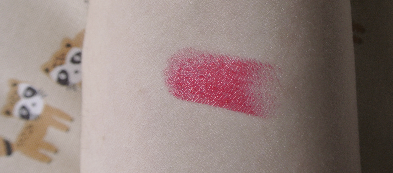
Fair warning: I do find the actual color just a tad cooler than the official swatches suggest. Just the tiniest bit, but still, for red hues, that can make all the difference depending on what you're looking for.


It depends a bit on the lighting, and strangely on the amount of layers I apply. The first layer seems slightly cool-toned, but a second layer goes away from pink undertones and leaves me with true red lips.

One lightly dabbed-on layer.


Second layer on top for stronger pigmentation.

Really like the even adherence to my lips and how the Creammellow lipstick makes
them look healthy and moisturized.

HUGE PLUS: This lipstick leaves an actual stain! The swatch on my arm left a red stain even after 8 hours and being washed off with water. It's a bit less forgiving around oily foods, but still, the staining power does pack a punch.

(Direct sunlight) - stain left after eating noodle soup and doing outdoorsy stuff for a couple hours.

The color lasts about 3 hours without eating, and fades very prettily without settling into lip lines or leaving uneven color - something Innisfree has managed really well with their lip products in general.

One layer, cloudy day natural lighting.
I'm getting old lol... 

Now for the sad part:

It seems the Creammellow line has been discontinued. They don't show up on the Korean innisfree site anymore (the Color Glow line has disappeared a few months earlier, too), having been replaced by the Real Fit Creamy Lipstick line.

Ironically, my review of the #3 Cream Coral lipstick literally ended with: "They won't run away." Nope, they ran.

While the Creammellow lipsticks are still available in global online shops, I did find a possible replacement for this particular shade. #4 of the Real Fit Creamy lipsticks is called exactly the same as #8 here, and the color does look similar (I never trust official swatches, though) if more warm. The finish seems more glossy, but again, that might just be the swatch and lots of Photoshop.

The new Real Fit Creamy line, #4 Moist Dewy Red
My favorite Korean beauty blogger on Naver has posted swatches of the entire line. I like her pictures since she doesn't Photoshop too heavily (a lot of Korean bloggers crank up the exposure and blurr all lines until all lipsticks look the same) and her swatches are all very accurate. Her swatch looks really similar to what I currently own, so maybe the actual color is the same and only the formulation has changed. #fingerscrossed

On that note, other shades of the Creammellow range that pop up in the new Real Fit Creamy range:

Creammellow #4 Warm Coral Grapefruit Tea is Real Fit Creamy #2.

Creammellow #7 Cherry Red is Real Fit Creamy #3.

Sadly, my old fav #3 Cream Coral is nowhere to be seen.

I want to take a look at those in store to compare the texture, too.

Some red lipsticks age me by about five years, so now that I've turned 28, I love that this one DOESN'T. 


Future restocking options aside, I really love this shade and line in general. 

- Strong, buildable pigmentation
- Brightens complexion instead of aging up
- Creamy texture that blends out lip lines and hides chapped lips
- No need for lip balm before use
- Very moisturizing
- Leaves a red stain
- Fades evenly
- Wearable red hue for daily use with one layer
- Strong enough for evening makeup with two layers

Affordable at 12000\ per lipstick, the new Real Fit Creamy line retails at the same price. 

Thank you for reading! :D Have a grumpy Hedwig to finish...

Two layers of the lipstick #8 - I like how well this shade works for casual settings, too!


17 September 2016

Innisfree Glow Tint Stick Review - #2 and #3

Summer is over and done, and I finally feel like wearing makeup again!

Seriously, July and August were entirely dedicated to sunscreen, waterproof eyeliner and beloved liptints, if anything. Some of these beloved ones are shown below~


This review has been a long time coming - it's for the Glow Tint Stick by Innisfree, which I've previously reviewed both for shade #6 and shade #7. I loved these so much that I grabbed #2 and #3 when there was a buy one, get one free event back in May.

While I've worn both colors a lot during summer, I never had the opportunity to use them together with foundation and actual makeup so I didn't take pictures until recently.


Since I've already introduced the principles of the Glow Tint Stick in my previous reviews, this is more of a shade comparison. Some of the shades do look quite similar and the official swatches aren't very reliable, so I thought I'd throw my own swatch pictures into the mix.

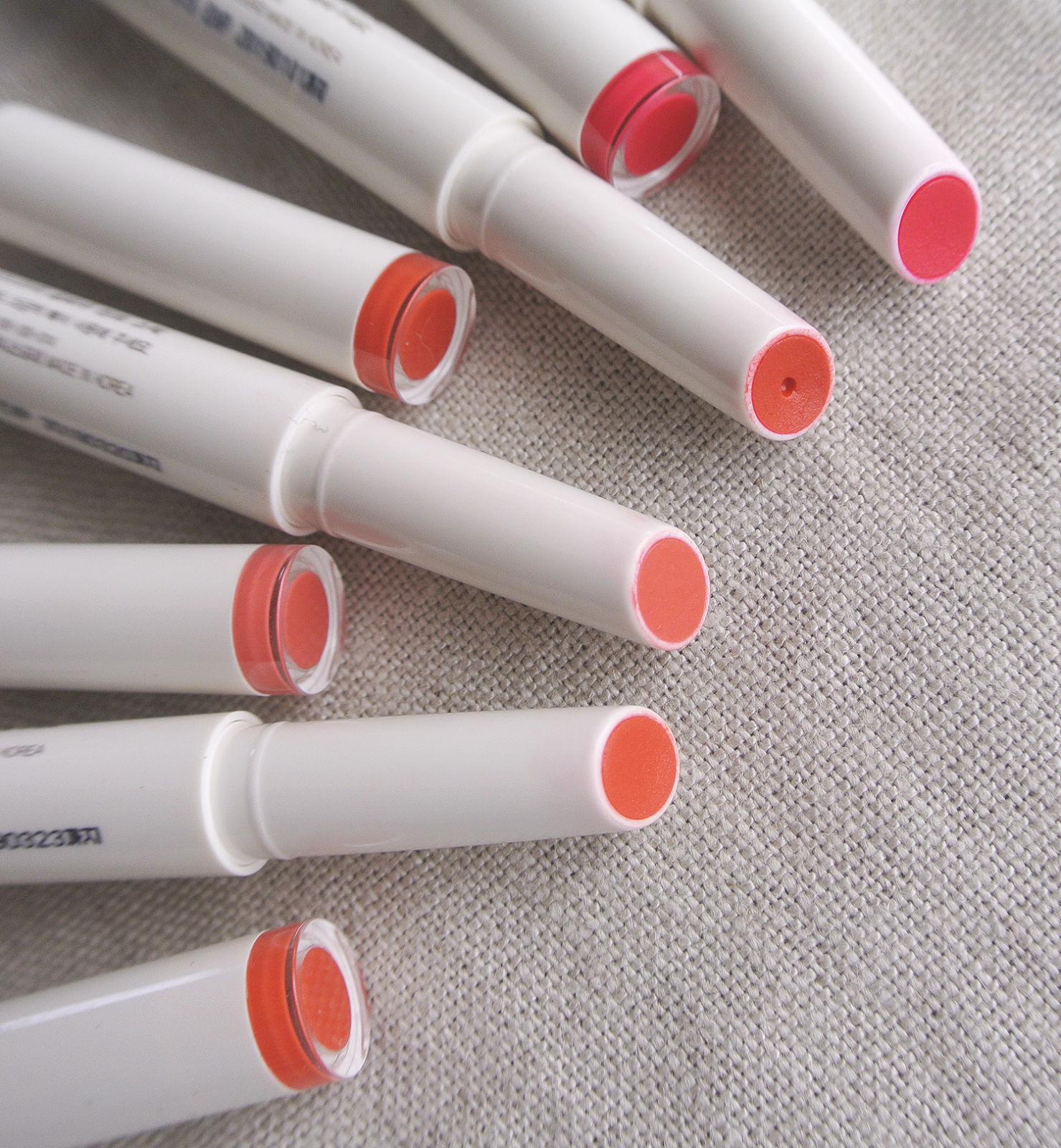
From left to right: #2, #3, #6, #7.

Shade #2 and #3 are both coral shades, and they do look quite similar at first glance. I was a bit worried that they'd be too similar to #6 as well, but their subtle differences are actually a lot more obvious once applied on the lips.


As a lover of corals and orange lip colors, this whole Glow Tint Stick color selection is a dream come true. According to innisfree, the colors were inspired by Jeju's sunsets, so... yup, might just be true.


I spot some #2 somewhere in there...!


Arm swatches - again, from left to right #2, #3, #6 and #7.


Shade #2 is called 'Clementine Spring Sunshine'
This coral shade is actually a truer orange than I expected, with hints of clementine (Jeju is famous for its clementines, so the title is a double fit). While it's a lot lighter and leaning more yellow than #6, it's still bright and saturated and perfect for summer days!


#3 is kind of hard to translate - 일렁이는 코랄빛 호수, which is the rippling waters of a coral-colored lake. There ya go.

This is a more peachy and milky coral shade. Where #2 is bright, this one is more muted, but the pigmentation and coverage are great anyway! It also holds up surprisingly well when it comes to staining power, with the lips tinted peachy even after meals. 
Korean's use the term 'lovely' for makeup looks a lot, and this color fits the bill for that. 
Swatch comparison! 

I also really like to combine the lighter shades with the darker ones for slight gradation lips. While I hate gradation looks where the outer edge of the lips is covered with concealer or completely nude, I do like to experiment with color combinations. The texture of these works really well when it comes to layering and blending, and due to the Glow Tint Stick's thin form, detailed application is easy even without a lip brush. 

The colors are pigmented and cover well, without feeling heavy on the lips.


How girly does #3 look? I hope I can still pull this off - by Korean age counting system I'm nearing my thirties. :')
It's a bit too peachy to count as a MLBB color, but I do use it quite like one.


#2 is a fun, bright shade that I love to wear with simple eye makeup. Since the staining power of this is great (especially considering that it's one of the three lightest shades in the collection) it's great for outdoors-y days.


These Glow Tint Sticks are just some of my favorites in general. Easy to apply, great colors, great pigmentation, light-weight texture, easy to transport (no leaking, no breaking), beautiful staining power, no settling in lip lines... I kind of want to get even more shades! Maybe something deeper for winter/fall? Don't tempt me, innisfree, don't tempt me.