30 November 2015

NaNoWriMo - An illustrated look at my Novel Writing Month

November is National Novel Writing Month. I hadn't known about that little fact up until last year when I promptly decided to take part in it.

I'm not an author, strictly speaking. I have written, drawn and then gotten published comic books, but never before attempted to tell a story only in writing. So, on to new things!

Of course, I had to draw some character sketches on the by...

In any case, I used November 2014 to get going with a story idea I'd been playing around with for some years. Normally, when doing story concepts for comic books, I'd only write summaries, scene descriptions, portions of important dialogue and character studies before then heading into a detailed script mostly comprised of sketches. This works well enough, but every now and then, plotholes remain uncovered, or something from the beginning doesn't quite add up with the following narrative. And, with the publishing world being what it is and drawing being a run against time, changes become nearly impossible if one doesn't want to redraw the whole book once one reaches the end. Being into whimsical, complicated, sometimes overly crowded storytelling doesn't make it any easier.

So for that particular story idea, I wanted to do it right. I wanted to have the time to edit, to adjust and to polish before even sending the concept to my editor.
Writing came surprisingly easy. Not that it's good writing - but I was surprised at how naturally the scenes I'd imagined drawn came to life with just words. The 50'000 words were over way too fast, and the story only about a quarter done.

I had to focus on some other stories (Lost Ctrl was published in 2015, text editing had to be done, and then I started freelancing as an illustrator and working on a Korean fairytale retelling) but with NaNoWriMo 2015 rolling around, I was ready to dive into that little beast of a story again.

Trying to sort out some timeline issues...
I have some kind of mad scientist approach to story planning.
This is only the mindmap of the second quarter, most of the overall planning was
done back in 2014.
Fantasy is a genre I love, especially if religion, magic and mysticism take a front-row seat. But it's also a genre that's not forgiving to half-hearted worldbuilding and haphazard plots. Writing scenes, plot points and dialogue ahead of bothering with even the roughest of sketches helps me to find my way through the maze of my ideas and to bring them together. Adding in scenes from the point of view of secondary characters helps sort out some inconsistencies I wouldn't have noticed otherwise. Writing action scenes (hopefully) will help me to draw them as more engaging later on.

Hit 50k on day 26 - YAY!

I tried, and managed, to write more than the required 1667 words a day, never slacking off even when ahead of wordcount. As I was quite busy working at the restaurant, drawing commissions and freelancing, I forced myself to only start writing once all of the day's work was done, which often meant 11 pm or later. By that point, I was looking forward to an hour of concentrated writing so much that it was hard to stop myself from just keeping at it all night long. I reined myself in and wrote an average of 2000 words a day.

I can really recommend using writing during NaNoWriMo as a reward after the rest of your to-do list is checked off - it makes writing a treat instead of a chore.
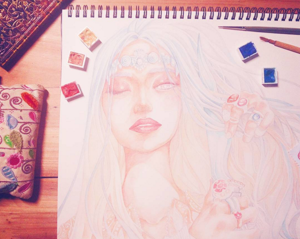
Another character concept illustration I'm still in the middle of drawing...
I did squeeze in some quick character illustrations during October and November (can't quite stop myself from drawing after all...) and am now looking forward to keeping on writing in December. I'll be visiting my family in Switzerland, and as I have neither a scanner nor all my materials over there, the amount of drawing commissions I can do keeps itself in check. Which means: Forced Freedom. Vacation. Time to write during the days, hopefully.


I've got three main characters, three women that grew up in the same temple and have the same name. They were like sisters once, but the story starts years later, when they're all at very different places in life. 
I'm really looking forward to drawing their very different points of view. Especially the viewpoint of the blind priestess will be a challenge when it comes to depicting it.


I'm also experimenting with a more realistic art style mixed with my normal manga style, to fit the more sombre mood of the story I want to create. Maybe something like this? Still struggling.


This would be more typical for me (and easier to keep up over hundreds of pages, mind you), but I'll keep doing style tests until I've finished the script.

Did you participate in NaNoWriMo? Would you like to try? What were your experiences?


20 November 2015

ILLUSTRATION PROJECT : SONG COVER "REFRESH"

Another one!

No, really, I hoped that I would be able to create another album cover in the future after I did the last one, but I wasn't expecting it to happen this fast!

어쩌면 아티스티 is coming out with a new single, and I was asked again to create the illustration for it. Still watercolors, still Jeju-themed, but a bit more playful.


The new single is travel-themed, but more light-hearted than Jeju Baram / Wind of Jeju.

You can take a look (and listen) at a part of the song. It's being used as the promotional song of Jeju Air, so it's been playing on television for a while before it was now officially released by 'Maybe An Artist'.

http://www.melon.com/album/detail.htm?albumId=2651785

And the promotional video for Jeju Air. Someone please give me some money for sharing this.


As for the illustration itself, I was given a free hand and could do whatever I wanted. As the music is playful and light, I wanted to give a similar feel to the drawings and the overall layout. In the end, I went with a grid-layout, reminding of pattern games like tetris or puzzles (I hope haha).

Featuring a selection of individual images that remind me of a, well, refreshing vacation on Jeju - with the famous oranges and clementines giving the color scheme.

These pictures kind of scream to be reused for stickers or post card motives, but I have to hold myself back or I'll single-handedly fund that printing company with all my orders recently.


Actually, I did a lot more illustrations, because I'd originally planned to make the pattern much smaller overall. That turned out to look way too convoluted and even plain unreadable. So here's some of the B-cuts!


Here's some sort of island that could be Sanbangsan, or just good ol' Jeju Island itself.


And of course the traditional houses of Jeju. There's a LOT of these around where I live ('cause I'm a country bumpkin) and they look plain adorable with their red, blue and green roofs.

8 November 2015

MAKEUP ILLUSTRATIONS AND, finally, ARTPRINTS AND STUFF

If you've been following my blog since its creation not too long ago, you may have noticed how my initial 'daily drawings' evolved into makeup sketches and have gotten more detailed and elaborate along the way. Now I've finally gotten around to printing some of my works onto gift cards, textiles, hand mirrors and stickers!

Update 2016: You can find the prints and stickers in my Etsy Shop, too.


From the beginning, I had lots of fun doing these little beauty drawings. I started to use them for makeup reviews and, through this blog and instagram, even got several art commissions!
I wanted to introduce some of these projects to you. I'm experimenting with slightly different art styles for each of them, so hopefully this will be interesting.

First, my collaboration with Bisou Beauty Bar. Bisou is an online store, selling an interesting selection of both high- and low-end Korean brands in Canada.

Since we've started working together, I've created several product illustrations (for the cutest promotions ever??), as well as their business card and additional illustrations like the Pop-Up Shop below.


For these, I tried to make the overall feel of the illustrations more 'professional' - not as cutesy and simple as the ones that I'm using for my own reviews, but still colorful!


Then, I got two Blog Header commissions in short succession. For them to not look similar, they were created with a different atmosphere and, of course, color scheme in mind.


Shia from 'Shiaswelt' contacted me first, and to fit her new blog design I've included soft brown linearts with a mostly rose color palette. While the individual products are quite cute in their packaging, I tried to give the overall illustrations an elegant vibe!

She even uploaded some of the sketches and wips from this project! Way more dilligent than I am myself... haha...

Sooyoona from 'Something Beautiful' was up next, and I worked on both illustrations more or less simultanously. Her color preferences were blues and greens, and as we included not only makeup products, but a variety of other personal favorites of hers, the header became more and more colorful! The result was a playful, vibrant illustration with lots of whimsical details.

Check out both of their blogs to see the header images 'in action' and, of course, have a look at the blogs themselves! It was fun to work with K-Beauty Bloggers from my home country Switzerland and neighboor Germany! :)


So, what now? Now it's time for a little online store!

I really want to pursue this direction with my art. While I love drawing Manga and Children's picture books, and of course have to do my monthly share of bread-winning freelance illustrations, I really enjoy combining my love for drawing, watercolors and makeup!

Now that I'm done with printing, I'm really excited to show you some of the pictures!

I've made a Google Form to function as an online store - it's always been the easiest way to keep orders in one place!


So, I'll mostly do a blog sale here during November (I'll start shipping out items on the 16th, but orders can already be made!), pause during December, and then do the full-scale Etsy launch in January. (edit 2016: Well, it happened in February)


The stickers were made primarly because my cushion cases are old, battered and ugly, and I wanted to decorate them! There's been so many limited editions of cases released this  year in Korea, but I resisted hah...


...I'm really happy with how these turned out! :)


Additional, higher quality images of all products can be found in the order form!


30 October 2015

Creating an Album Cover Illustration - 제주바람 '어쩌면 아티스트'

Hi everyone!

As the last few posts were all beauty-themed, I wanted to shake things up a little with this album jacket illustration I did for the Korean indie singer '어쩌면 아티스트', which translates roughly to 'Maybe an Artist'...! (She surely is one, though!)


The song is called 'Jejubaram', which means 'Wind of Jeju'. As I live on that very island, I was all the happier to create the illustration! It's the perfect music for peaceful traveling (on Jeju or anywhere else), so if you're curious, you can give the song a listen here:

'Jejubaram - Jeju Wind' by Maybe An Artist on iTunes

'Jejubaram - Jeju Wind' by Maybe an Artist on Soribada (only a quick sample there, but hey, for free! ;)

K-Indie is a genre I love listening to on long days in the Cafe, and Maybe An Artist does sing in that lovely, laid-back style I personally really enjoy.


As for the illustration itself:

Jeju Island is famous for its 'Gyul', aka mandarins, oranges and clementines in all kinds of variations. They range from walnut-sized to roughly the size of a large grapefruit and come in all kinds of flavor variations, too! The song's lyrics evoke the scent of mandarins carried by the wind, so the choice of a mandarin tree motive was quite simple! (though we did some other sketches first...)

Some quick studies done during inktober (while traveling to the south of Jeju with my parents) were the basis for the mandarin trees, as well as some pictures I took.

The album illustration was then made with a light pencil drawing as a base, on which I layered watercolors. I didn't want to make the colors too saturated, going for a more 'milky' look. You can have a look at my watercolor collection here - I mostly used Cobalt Green mixed with Cobalt Blue, both giving a slightly muted color. For the mandarins themselves Scarlet Lake, Neapel Yellow and Cadmium Yellow were mixed, and some additional shadows added with Burnt Sienna.

The little sketch I did previously has now been hurled at Photoshop to form this mess:

As I'm currently preparing a lot of little printing projects (stickers, postcards, hand mirrors...) I'll maybe use it as some sort of background pattern. We'll see!


Something like this. Looks kind of christmas-y already, doesn't it?? (...panic!)

I loved working on this simple illustration and hopefully more is to come! As for now, I hope you'll check out 'Maybe An Artist's Instagram or Maybe An Artist's Facebook - she's a lovely person, talented person and deserves more attention! :D


More illustration projects will follow! I'm in the middle of several commissions, some of them spanning months already, and can't wait to share!

Have a lovely weekend and thanks for reading!


19 October 2015

Korean Autumn Days Makeup - Innisfree Real Fluid Rouge in #8 Review

I'm on a review roll!

This one is for a new discovery: The 'Real Fluid Rouge' liquid lipstick by innisfree, re-launched just about a week ago. It was love at first sight! I've been using this color every day because it's just so versatile and fits the warm Jeju autumn days perfectly.

Find it. :D
These mini illustrations are for a sticker set I'm planning to print soon. Autumn version up first!
As I've said, the Real Fluid Rouge line was re-launched this October. There was a previous launch (with different colors and product texture) last spring during my several months long no-buy phase, so that kinda passed me by. All the more love to give now!

The Real Fluid Rouge is a liquid lipstick product (since last spring, a variety of other Korean brands have launched their own versions of liquid lipsticks. Etude House comes to mind.) and it's available in 12 different shades.


I got shade number 8, a slightly muted pink color. 분홍 사과꽃 한 잎, which translates into something like 'One petal of a pink apple tree flower'. Soft pinks have a tendency to make me look kind of dead, so I was happy to find upon swatching that this had just the right amount of color in it to look neither nude-ish nor like a hot-pink. I absolutely love it! It goes well with nearly everything - an otherwise bare (sunscreen) face, natural makeup or even light smokey eyes. It's the perfect pink for me, seriously.

The texture is hard to describe: A thick liquid that seems sticky upon applying but settles into a nice lipstick-like texture. It reminds me of the Mellow Lipstick line with its buttery finish. I haven't loved a texture and finish this much since those lipsticks came out - you go, innisfree! Take all my money!


It does a decent job at moisturizing, too, and fades prettily (loosing the glossy effect first) over several hours. Neither transferproof nor staining, but still not that much of a high-maintenance product as it's easy to reapply without messing up the previous layer.

The packaging is super prettyyy. Seriously. It's much bigger than I imagined but looks sleek and elegant. From the outside, the shade looks a bit cooler than the actual product on my lips.


As I've been wearing it every day, I thought I'd show you my daily makeup look recently. Keep in mind that my makeup skills are non-existant, though. I SUCK at eye makeup and literally everything that's not foundation. Applying my makeup next to a small window in an otherwise dark room with a propped-up hand mirror certainly doesn't help. But anyway, it's what works for me on most days, and on all other days I can just give up and relie on my fringe to at least cover up my eyebrows...


The products I've used most often recently.

There's my old (...three years and counting) 'Choco Eyebrow Powder Cake' from Skinfood. I just can't bother to buy a new one, as my brow game is a loosing battle anyway. It works just fine, the shades fit, and I still haven't used it all up. It also smells like chocolate, seriously!

For eyeliner I love the Mamonde Soft Melting Liner in black. It's precise, doesn't smudge, doesn't drag and doesn't irritate my eyes. Mostly I just use this to tight-line my eyes.

(Mamonde is a secret love of mine anyway, taking second place behind Innisfree. It's not a really well known brand internationally, but I've loved every product I've tried so far!)


... which is evident in my current foundation choice, too. I've replaced my Iope cushion with a Mamonde 'Moisture Mask Cushion' refill. That's what I love about cushion cases - buy one, then put in whatever refill you currently have. Korean brands do seem to want me to buy more cases, though, as they're releasing special edition cases left and right. This is one of the reasons I want to print some stickers - at least I can decorate my basic cushion cases myself! Hah!

I chose a darker shade than usual for this one: #21 Peach Beige.

I look like a ghost most of the time, but with this on I actually look like I've seen the sun in recent months while still looking natural overall. Also tricked my parents into thinking I wasn't too pale this time around.

It's a very moisturizing cushion foundation and perfect for autumn. I still prefer my (ghostly white) Innisfree 'Ampoule Intense Cushion' in #13, though, as it applies more thinly (less coverage, but nicer finish) and I personally prefer the color.

As for eyes, if I actually make the effort, I'm using these two Mineral Single Shadows by (take a guess) Innisfree.


One is new, one is old. Again, take a guess.

The 'Fondant au Chocolat' shade is pure love in an eye shadow pan. Buttery, matte and just such a pretty warm brown. Innisfree came out with these new versions of their Mineral Single Shadows so during the sale event, I quickly grabbed this one. It's #9 of their 'matte' line.

The other, beige color (#22 of the old Mineral Shadow lineup, though after the recent relaunch it seems to be the #3 of their 'matte' line) has been used extensively over the last year. It's the perfect base shade for me, a matte yellow brown slightly darker than my skintone. I can also use it for shading, though I'm mostly too lazy for contouring of any kind...

That's it.
Like I said, I'm terrible at makeup despite loving it. For some reason, drawing skills don't translate into makeup skills.

Also, sorry for taking pictures with a messy fringe like that. *crawls into hole because awkward*

So bored. So, so bored. :'D
Instead of a resting bitch face I've got the resting bored face.
See what I mean with the muted pink but still-not-pale-pink-or-nude-pink? It gives just the right amount of color without being over-powering. And it's shiny without being all gooey like a lip gloss. I really love everything about this.

Also visible: Putting on slightly darker, yellow-ish foundation on the face without blending towards the neck. Well done.

Fringe will never do what I want it to do...
I really love everything about this product! I'll definitely go and buy at least one more shade of this range - maybe the red one (#6) or a coral shade (#3). The texture is so good I'd take any color, really.

You can have a look at the shade selection available here. Nearly every shade is named after some form of 'apple' color, like 'apple juice'. Doesn't the red one look gorgeous?


Thanks for reading! Say 'hi' to Hedwig the cat! :D

What are your favorite products for autumn? 
Did you try the spring version of the Real Fluid Rouge lipsticks? 

Update:
You can find the illustration motive from this blog post


13 October 2015

REVIEW: Aritaum Color Lasting Tint in #13 THE RED ONE

Hello, I'm back with a review - for a product I'd introduced once before and recently got my hands on another color! It's the Color Lasting Tint by Aritaum in the shade aptly named 'The Red'. How red is it? How long lasting is it? Let's have a look!

(That has to be the cheesiest blog post introduction I've written so far...)


First off, EXCUSES:
My parents were visiting me here on Jeju, Korea, which is why I haven't been posting in a while. 

Also, they kind of attacked Innisfree stores for presents (even my grandmothers use Korean skincare by now haha...) which was my excuse for buying way too much stuff.

So of course I tagged along and gave recommendations and used my customer card to reduce prices and collect points and whatnot... which escalated into hauling literally EVERYTHING I'd had my eyes on over the past year. I've got so many new products that just reviewing them on a weekly basis would fill this blog for the next few months, though that could get quite one-sided and boring.
This Color Lasting Tint was an impulse buy from before though.
I was in the mood for something really red and noticed that I actually don't own anything that isn't either orange or pink. I wanted something easily wearable during the day, something long-lasting that doesn't require touch-ups and as the Fuchsia shade of the Color Lasting Tint that I reviewed last time was blindingly pigmented as well as nearly indistructible on my lips, I decided to play it safe and choose something from the same line. 

As shade #13 is actually named 'The Red' it seemed perfect. 


Same packaging as before, with the sleek long black tube, the appropriatly red details and the very convenient doe-foot applicator. As with the Fuchsia one, this applicator really works well for pigmented lip tints, it just makes the application and blending easy, even for a clutz like me.


It picks up the perfect amount of product for one full layer, which in the case of this shade is already enough for a really bright and intense color! I've tried to put another layer on top, and the color blends in nice and evenly while building up the pigmentation. 


I tried to keep the lip swatch as true to how the color looks in reality as I could. It does have the SLIGHTEST cool undertone once the shine goes away (which is after one or two hours) though for some strange reason it looks warmer when first applied. 

On the lip swatch, the top lip was 'tapped' on with my finger, so there's no shine and you can see the underlying berry-hue. The bottom lip was a full-on layer of color applied with the doe-foot applicator, and the shine looks a bit more orange, right? The overall effect is a nice red that could suit both warm and cool skintones as the differences are so subtle. It really suits my skin, being bright red while neither looking too vampy nor artificial.


It's a bit more evident here in the swatches on my hand: Freshly applied it's a bright, slightly warm red, while after blending and rubbing and drying (...it is crazy long-lasting at that stage) it gets pinkish.

Speaking of long-lasting and fading, I do like this shade less than the Fuchsia one when it comes to its lasting power. The stain is there and stays there alright, but it has a tendency to cling to chapped spots and the inner parts of my lips, giving off an effect similar to what I get after drinking red wine. It's not too bad, and if you don't have chapped lips (who doesn't? seriously??) it might not concern you at all. As I wanted something that lasts me through the day without touch-ups, I was a bit disappointed though. 

After about three hours, it looked like this. It's not too evident in the photo, but it settled in patches and in lines, too. Can be saved easily by reapplying something like tinted lip balm on top of it. I actually loved it when applied as a base underneath other lipsticks - just tapping on a bit of the tint for a red hue, then put whatever less long-lasting product on top. Works well with coral or pink lipsticks! The tint doesn't settle into lines and patches when it's applied thinly like that...

As for a full-on picture for comparison:


THE RED is ... red! Very bright! I really love how it doesn't go too dark despite being so pigmented. 

For reference (if you want to compare your skintone or something) I was wearing the Iope Air Cushion XP in the 22 shade that has shimmer in it - I got talked into buying that by the sales assistant last year. She insisted that it would be a better match than the more yellow-toned, darker shades. After using it several times I have to disagree: It's way too pink for my skin (look at my neck for comparison...) and it has actual shimmery particles in it, which I hate with a passion. The finish is gorgeous though, so I use it anyway sometimes. 


The crux of that little story and the whole review:

The #13 Color Lasting Tint "The Red" shade goes well with both the cool-toned pink-ish Iope Air Cushion, my other one (Innisfree #13) and my bare skin/sunscreen. It's really versatile! 

It doesn't look over the top during the day, as there are no dark/burgundy undertones, and the shiny finish makes it look summery! 

The lasting power is, as mentioned, long, though it stains differently in dry patches which doesn't look too pretty in the long run. 

Still looking for the perfect red (I may have found some in my recent hoarding of Innisfree products!) but this one is a nice base color and can look great on its own when properly taken care of!


As always, thanks for reading and I hope to see you soon for more illustrations (I've finished another project~) and whatever review I feel like next. If you're curious about certain products (lips? foundations? skincare?), tell me in the comments! Also, if you have any recommendations for a true red lip tint, I'm all ears! Thank you!