Showing posts with label MOTD. Show all posts

27 October 2016

Dewy Red - Innisfree Creammellow in #8 Review

Winter is coming (...) and I'm revisiting my old favorites for the colder season. That means lipbalms, the return of facial oils and my Creammellow lipsticks.


I've reviewed shade #3 'Cream Coral' previously but actually bought both at the same time (yay 1+1 sale events). The Creammellow range by Innisfree is perfect for the colder months, with a very moisturizing formula (containing Camellia Oil) that hides my terribly flaky lips.
Red lips~ 
The one I'm reviewing today is my favorite red lipstick, shade #8 Moist Dewy Red.

I've yet to find another Korean lip product that combines strong pigmentation, a neutral red shade and wearable, moisturizing texture (plus affordable pricing...) and believe me, I've been searching.


The Creammellow line was a follow-up to the Color Glow Lipstick by the same brand, sporting a creamier, heavier texture but similar design. Overall, the colors are also more durable, glossy and the release was autumn-themed, with the marketing focusing on deep or muted/nude shades.


Back then, finding good MLBB nude-ish shades or darker reds was still a bit of a struggle in the very brightly colored Korean lipstick world, so I went with the mentioned Cream Coral #3 and Moist Dewy Red #8 for their novelty.


The rose gold accents differentiate the Creammellow lipsticks from the Color Glow's silver ones.


Fair warning: I do find the actual color just a tad cooler than the official swatches suggest. Just the tiniest bit, but still, for red hues, that can make all the difference depending on what you're looking for.
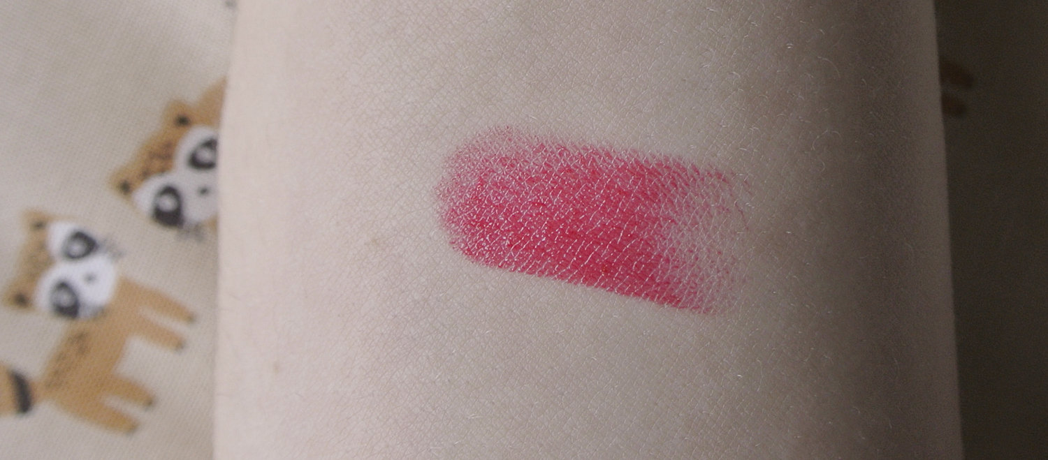


It depends a bit on the lighting, and strangely on the amount of layers I apply. The first layer seems slightly cool-toned, but a second layer goes away from pink undertones and leaves me with true red lips.

One lightly dabbed-on layer.


Second layer on top for stronger pigmentation.

Really like the even adherence to my lips and how the Creammellow lipstick makes
them look healthy and moisturized.

HUGE PLUS: This lipstick leaves an actual stain! The swatch on my arm left a red stain even after 8 hours and being washed off with water. It's a bit less forgiving around oily foods, but still, the staining power does pack a punch.

(Direct sunlight) - stain left after eating noodle soup and doing outdoorsy stuff for a couple hours.

The color lasts about 3 hours without eating, and fades very prettily without settling into lip lines or leaving uneven color - something Innisfree has managed really well with their lip products in general.

One layer, cloudy day natural lighting.
I'm getting old lol... 

Now for the sad part:

It seems the Creammellow line has been discontinued. They don't show up on the Korean innisfree site anymore (the Color Glow line has disappeared a few months earlier, too), having been replaced by the Real Fit Creamy Lipstick line.

Ironically, my review of the #3 Cream Coral lipstick literally ended with: "They won't run away." Nope, they ran.

While the Creammellow lipsticks are still available in global online shops, I did find a possible replacement for this particular shade. #4 of the Real Fit Creamy lipsticks is called exactly the same as #8 here, and the color does look similar (I never trust official swatches, though) if more warm. The finish seems more glossy, but again, that might just be the swatch and lots of Photoshop.

The new Real Fit Creamy line, #4 Moist Dewy Red
My favorite Korean beauty blogger on Naver has posted swatches of the entire line. I like her pictures since she doesn't Photoshop too heavily (a lot of Korean bloggers crank up the exposure and blurr all lines until all lipsticks look the same) and her swatches are all very accurate. Her swatch looks really similar to what I currently own, so maybe the actual color is the same and only the formulation has changed. #fingerscrossed

On that note, other shades of the Creammellow range that pop up in the new Real Fit Creamy range:

Creammellow #4 Warm Coral Grapefruit Tea is Real Fit Creamy #2.

Creammellow #7 Cherry Red is Real Fit Creamy #3.

Sadly, my old fav #3 Cream Coral is nowhere to be seen.

I want to take a look at those in store to compare the texture, too.

Some red lipsticks age me by about five years, so now that I've turned 28, I love that this one DOESN'T. 


Future restocking options aside, I really love this shade and line in general. 

- Strong, buildable pigmentation
- Brightens complexion instead of aging up
- Creamy texture that blends out lip lines and hides chapped lips
- No need for lip balm before use
- Very moisturizing
- Leaves a red stain
- Fades evenly
- Wearable red hue for daily use with one layer
- Strong enough for evening makeup with two layers

Affordable at 12000\ per lipstick, the new Real Fit Creamy line retails at the same price. 

Thank you for reading! :D Have a grumpy Hedwig to finish...

Two layers of the lipstick #8 - I like how well this shade works for casual settings, too!


17 September 2016

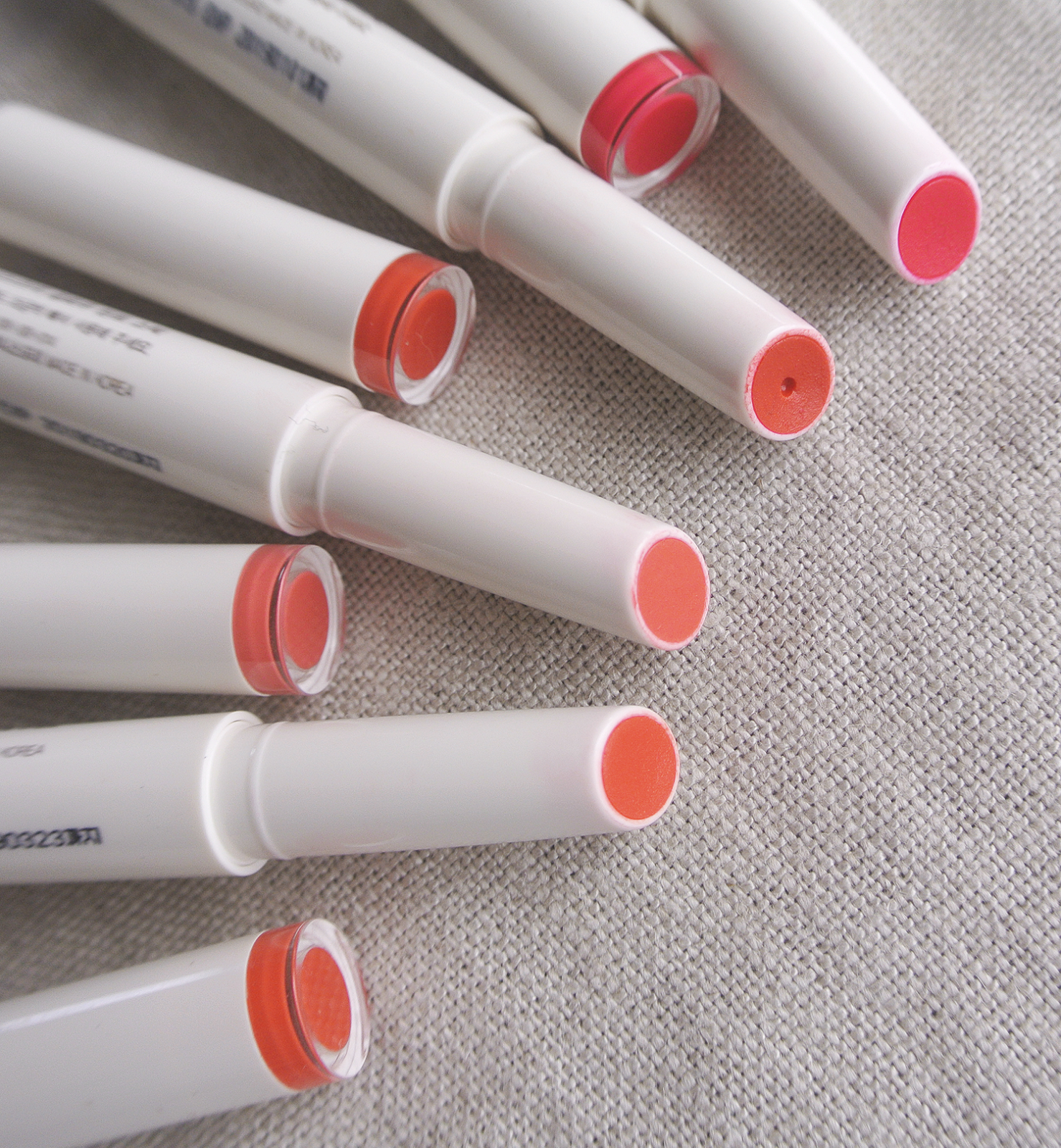
Innisfree Glow Tint Stick Review - #2 and #3

Summer is over and done, and I finally feel like wearing makeup again!

Seriously, July and August were entirely dedicated to sunscreen, waterproof eyeliner and beloved liptints, if anything. Some of these beloved ones are shown below~


This review has been a long time coming - it's for the Glow Tint Stick by Innisfree, which I've previously reviewed both for shade #6 and shade #7. I loved these so much that I grabbed #2 and #3 when there was a buy one, get one free event back in May.

While I've worn both colors a lot during summer, I never had the opportunity to use them together with foundation and actual makeup so I didn't take pictures until recently.


Since I've already introduced the principles of the Glow Tint Stick in my previous reviews, this is more of a shade comparison. Some of the shades do look quite similar and the official swatches aren't very reliable, so I thought I'd throw my own swatch pictures into the mix.

From left to right: #2, #3, #6, #7.

Shade #2 and #3 are both coral shades, and they do look quite similar at first glance. I was a bit worried that they'd be too similar to #6 as well, but their subtle differences are actually a lot more obvious once applied on the lips.


As a lover of corals and orange lip colors, this whole Glow Tint Stick color selection is a dream come true. According to innisfree, the colors were inspired by Jeju's sunsets, so... yup, might just be true.


I spot some #2 somewhere in there...!


Arm swatches - again, from left to right #2, #3, #6 and #7.


Shade #2 is called 'Clementine Spring Sunshine'
This coral shade is actually a truer orange than I expected, with hints of clementine (Jeju is famous for its clementines, so the title is a double fit). While it's a lot lighter and leaning more yellow than #6, it's still bright and saturated and perfect for summer days!


#3 is kind of hard to translate - 일렁이는 코랄빛 호수, which is the rippling waters of a coral-colored lake. There ya go.

This is a more peachy and milky coral shade. Where #2 is bright, this one is more muted, but the pigmentation and coverage are great anyway! It also holds up surprisingly well when it comes to staining power, with the lips tinted peachy even after meals. 
Korean's use the term 'lovely' for makeup looks a lot, and this color fits the bill for that. 
Swatch comparison! 

I also really like to combine the lighter shades with the darker ones for slight gradation lips. While I hate gradation looks where the outer edge of the lips is covered with concealer or completely nude, I do like to experiment with color combinations. The texture of these works really well when it comes to layering and blending, and due to the Glow Tint Stick's thin form, detailed application is easy even without a lip brush. 

The colors are pigmented and cover well, without feeling heavy on the lips.


How girly does #3 look? I hope I can still pull this off - by Korean age counting system I'm nearing my thirties. :')
It's a bit too peachy to count as a MLBB color, but I do use it quite like one.


#2 is a fun, bright shade that I love to wear with simple eye makeup. Since the staining power of this is great (especially considering that it's one of the three lightest shades in the collection) it's great for outdoors-y days.


These Glow Tint Sticks are just some of my favorites in general. Easy to apply, great colors, great pigmentation, light-weight texture, easy to transport (no leaking, no breaking), beautiful staining power, no settling in lip lines... I kind of want to get even more shades! Maybe something deeper for winter/fall? Don't tempt me, innisfree, don't tempt me.


19 May 2016

Innisfree Mineral Single Shadow Review - Eyeshadow Palette and Simple Daily Look

It's been a while! I've been sick for quite some time this month, so I didn't seem to find the time to do a blog post, despite having all the pictures at the ready...

But now there's really way too many pictures dying sad slow deaths on my harddisc, so here we go!


As you might know, I do use a lot of Innisfree's Mineral Single Shadows. While I prefer the Aritaum Mono Eyes Shadows when it comes to pigmentation, I like the more natural shades of the Mineral Single ones better for everyday use.

So recently I took the plunge and bought a large palette case to organise my stash.

This review is a two-parter: A quick look at the palette itself, and at one specific color that I've been loving recently!

  
First, the palette. As with a lot if not all innisfree products, the design is really simple, with an ivory base color and the logo.

The case does feel a bit clunky, since it's so big. The lid closes very, very securely, aka: I can't open it without nearly breaking off my nails every single time. I mostly just leave it half-closed. Despite that, the case feels sturdy and quite luxurious for the price of 10,000 Won.

There are two other sizes available: A six slot one for 8,000 Won and a three slot one for 6,000 Won. So if you've got a lot of shades and want to organise them without transportability being an issue, you might want to get the largest one. ;)


I've chosen the largest one, with a total of 12 empty slots, one of which is occupied by a black sponge thing to... I don't know what that's really supposed to be. To tap off excess powder? To 'clean' the brush? I'll remove it soon and put another color in that slot, as it's completely useless in my eyes.

Selling point for me was definitely that huge mirror. I now do nearly all my makeup with just that palette propped open on the table.

A quick look at my color selection: You can see I'm a warm color type of girl. Leaving out that odd indie pink shade, I mostly own bronze-brown-orange hues. I've accumulated these over the last three years, so the palette contains shades from the old as well as the new formulations (which, by the way, are a lot better than the old ones).

My most used shade is the one still in its own case, though, since I want to be able to toss it into my pouch if needed. The Mineral Single Shadows come in these small pots that have a little hole on their back that makes depotting very easy - just insert something like a needle into the hole and push, then use the glue in the pot to stick the eyeshadow into the palette.


The palette comes with a double-ended brush that was a positive surprise. While one side is a good ol' sponge applicator, the other side sports an actual mini brush. The bristles are soft and the brush is all nice and fluffy, just large enough to do some emergency blending.


I did go ahead and decorated the case. Huge white spaces do that to me.


The color I wanted to swatch for you is the deep red one in the picture below.


The new shade selection of the Mineral Single Shadows is divided into four parts: A group for matte shades, one for shimmer, one for glitter and one for 'trend' colors that are switched out every season. The red color was part of the Trend selection of last year's autumn release and is called 'Camellia Garden at Dawn'. 

Below you can see the current spring trend colors (I believe they will switch those up soon?) 
I'm eyeing the one in the middle of the top row, since it's called 'Soft Banana Pancake'. :D

Official Innisfree Homepage
While I do own my share of reddish eyeshadows, this one has turned out to be the most wearable for simple, daily point makeup while still being really, really red. Despite being a fall color, it's just bright and shimmery enough to go well with spring or summer, too.


It isn't leaning too much into a burgundy wine color, and has no cool undertones. There's a subtle, slightly golden shimmer and the pigmentation isn't too intense, so I can pull off a one layer wash all over the lid.


I mostly like to use it as a point color at the outer edge of my lid, though. Especially since my fringe is growing out and hiding my eyes, a little splash of color helps to bring them to the foreground.


The new formulations of the Mineral Single Shadows are buttery and hold up really well. I don't need to use an eye primer for these. For a more intense color, you need to layer two or three times.


This is my go-to eyemakeup look when I'm pressed for time, but do want to look like I have makeup on (as opposed to a more natural look).

A wash of my all-time favorite shade all over the lid (the old #22 Cashmere, which has been reformulated and is now shade no #3 of the Matt selection. Looks slightly lighter than the old one, though!) then adding #8 on the outer triangle of my eye, blend to the under eye. Tightline with either a gel liner or, in this case, the Aritaum Micro Brush Pen Liner in black for a very thin eyeline.

To finish the eye makeup, I only add mascara (Innisfree Microcara in brown) or leave my lashes as they are since I'm lazy.


On my lips is the Innisfree Glow Tint Stick in #6.

That's it! Very simple and quick.

Would you like to see more swatches, especially from the new range of eyeshadows? :) I'm terrible with eyemakeup, but swatching, that I can do!

Thank you for reading and see you soon!


27 April 2016

Makeup Review : Innisfree Glow Tint Stick in #6

Finally, my review for the other shade I got from innisfree's Glow Tint Stick line.

I'd planned to get this up just after the one for the Glow Tint Stick #7, but the month just flew by. At least I remembered to scan the accompanying little illustration this time around!


Shade #6, "Warm Coral-Shine Spring Sunset" - or something like that. Innisfree's shade names get harder and harder to translate - caught my interest as soon as the promotional images were released. A warm, slightly orange-ish and bright red.

Official swatches for the Glow Tint Stick
But there the confusion already began, because if you compare the official swatch pictures below with the promotional image featuring brand model Yoona, shade #6 looks a lot brighter and glaring in the above!

Official promotional images for shade #6
I was confused, but not too worried, as both color variations would be up my alley. I was hoping for something more on the warm-red front than the bright-orange-red front, though, because good, warm reds are a bit hard to come by.


The packaging is, of course, exactly the same as in my previous blog post. A long, slender stick with a twist-up system that doesn't allow the product to retract.

The description on the packaging stresses how important it is to not twist up too much product. Never more than 1mm, though I mostly get by with even less for a full coverage application.


The shade is indicated both on the colored caps and the bottom, where product number and name are printed in very, very small letters. *squints*


I went with the two brightest shades from this release. Both #6 and #7 are more summer than spring shades in my mind - I was craving summery temperatures, I guess!


Swatching revealed two things: That the shade was more on the orange side than the official swatches indicated, and that it would be impossible to get the same deep coverage as in the promotional picture. Layering the product does help, though, and the orange hues get redder and deeper instead of just brighter.

There's some shades that look nearly the same no matter the lighting, but this jumps from a true orange in sunlight to a warm coral in indirect light.

As I love orange/coral lip colors, that was no problem for me personally, but if you're looking for a color exactly identical to the one in the promotional material, be warned!

One layer in direct sunlight.
Leaning orange and a bit of piling into my lip lines.

The pigmentation for this product is great, but at the same time it gives a very transluscent finish - an interesting combination and very forgiving on dry, patchy lips! The original lip texture shines through, but is smoothed out and moisturized by the product.

While the application is simple and precise thanks to the small tube, you can see that the Glow Tint Stick doesn't apply perfectly evenly, piling up against some of my lip lines. It isn't noticeable if you don't point a camera with a macro lense at it, though. ;)

#7 did apply more evenly than #6, strangely! It's a tiny difference, and I only noticed after looking at the pictures.

One layer, no direct sunlight.
The color does look deeper, closer to the promotional images with the model, but less bright
than the official swatches.
The piling gets a bit worse with each layer, but can be smoothed out if tapped on with finger.
True to its name, the Glow Tint Stick gives a shiny finish. The slightly sticky texture warns of what is to be expected of nearly every glossy product: It transfers and does rub off when eating or drinking. It leaves an even stain in a coral-orange tone that lasts for several hours, though. And as the packaging allows for taking the Tint Stick with me in my bag without fear of it breaking or leaking, reapplication was very easy.

No lip brush is needed for a precise outline, which makes the Glow Tint Stick line perfect for traveling or quick application.


Here's another example of one layer versus two layers! Both taken in indirect sunlight.

One layer already gives a nice punch of color, moisture and shine, and I often use this for simple daily looks, as the orange in it isn't too neon-y glaring.


While even two layers don't give the deeper red I'd hoped for, I'm still really happy with the shade! Sometimes orange lips, especially saturated ones, are hard to pull off, but Glow Tint Stick #6 walks that fine line between an orange and a red that puts it into the easy to wear, fits-nearly-everything category. This would be perfect if you have neutral or warm undertones!

I can mostly tell if I suit a color if the pictures for reviews turn out well - this time I had so many to choose from where my face didn't look totally awkward, so this shade is a winner. :)


Overall I totally love this line, despite the slight inaccuracy in their promotional swatches (let's be honest, which brand does actually get those exactly right?) and the lipline-piling. Those get balanced out by how gorgeous the actual colors are and how moisturizing and shiny the product is!

I wish the shine would last through meals, but am happy with the stain it leaves behind.

The packaging is sleek and sturdy, easier to use than I'd hoped and perfect for someone who values precision.

Confession: I've picked up two more shades from this line during their recent 1+1 event, so I'm now the proud (and slightly guilty) owner of #2, #3, #6 and #7. Owning this many colors of one and the same product range is a first for me!

#2 and #3 are quite similar shades, so if you'd like to see swatches, I'd combine those into one post. Both work really well in combination with the two brighter shades, too!


Thank you for reading and see you soon with more reviews! May will be a lot calmer than April, so I hope to get a lot of blogging in~