Showing posts with label Step by Step. Show all posts

31 March 2016

Makeup Illustration for Purpletale

News on the makeup illustration front before the month is over!


Because I went to Seoul over the weekend, this month's end is coming on way too suddenly! I'd planned to get at least one more makeup review up, but yeah, here's a quick work update instead. 

While what I call my monthly salary as a freelance illustrator comes 90% from things like textbook illustrations, coloring books, layouting and other large serial orders from companies, there's also these fun little projects in-between that I love so much! 

This is another example - an illustration for new skincare brand 'Purpletale'!

Check out their international website here, or their Korean one here


The illustration depicts their current product range - 8 products in total, mostly in the skincare department, but there's a BB cream and primer, too.


We went for a 'flatlay' look, and as the brand's names are all (really adorably!) inspired by stories, books and fairytales, I added details like book pages and book illustrations in the background. 


Which gave us the possibility of featuring the main ingredients in the form of a textbook-like illustration beneath the products. Nifty, right?


Patterns on book covers! I had so much fun with these, especially since this time, I didn't use any sort of outlines except faint pencil guides. It makes for a softer, polished look.


Adding color on a large format (and for watercolor and me, anything beyond a postcard is a large format) without the paper going all wavy or the overall color scheme falling apart requires layering. 

As in, I started with mostly gray and sepia hues, and then slowly added blues (the pigments for those are softer than most purple tones) to define shadows and lights. 
You can't 'erase' what you've already put on paper, so a careful and slooow approach works best. 

Only when the general form of all individual objects and the lighting are sorted out, the brand's name-sake color came into play. 


While I wanted the overall look to be soft and elegant, I still needed the borders to be crisp or the whole thing would just look like a mint-and-purple cloud. :')
So my smallest brush carried the picture on its, maybe, three hairs. 
(I've since bought a new one, it got all worn out over the year. RIP.)


For the digital close-ups, I scanned the A3 picture on 600 DPI, did the whole post-processing marathon in Photoshop, and then added additional color layers to play up the purple and mint.


I was especially excited for the shiny, sleek packaging design of the brand in combination with the more subdued book pages in the back. 

Writing with a brush is always fun, too!

Purpletale Korean Skincare Brand Neck Cream Illustration

The Neck Cream has to be my favorite part. I wanted to let the page in the background look like something out of an illustrated fairy tale book or a high-fantasy novel, and am happy with how the white spaces turned out. 

For some of the white-on-color details I used a white pigment with a nib pen to get a cleaner result.


This is the banner collage for the website. I didn't know about the precise format ahead of time, so there was a quite a bit of cutting, masking and moving about involved. 


I got the real thing, too! 
These sheetmasks are HUGE. Seriously, have a comparison picture with my grumpy cat Hedwig.


Already excited to use this multi-faceted product. The 5 Steps To Lovely Skin includes a Cleansing Foam, an Ampoule, a Sheet Mask (of course!), a Facial Cream and a Neck Cream, so it's like a deluxe sample set perfect for traveling.

.... now I need the time to go traveling, though.


That's it for this little look at work! See you again in April!

Just a little preview for the next sticker set here:


A spring edition, but psst! ;) Should be ready and printed in about two weeks.

You can find my previous stickers on my Etsy shop here~

20 November 2015

ILLUSTRATION PROJECT : SONG COVER "REFRESH"

Another one!

No, really, I hoped that I would be able to create another album cover in the future after I did the last one, but I wasn't expecting it to happen this fast!

어쩌면 아티스티 is coming out with a new single, and I was asked again to create the illustration for it. Still watercolors, still Jeju-themed, but a bit more playful.


The new single is travel-themed, but more light-hearted than Jeju Baram / Wind of Jeju.

You can take a look (and listen) at a part of the song. It's being used as the promotional song of Jeju Air, so it's been playing on television for a while before it was now officially released by 'Maybe An Artist'.

http://www.melon.com/album/detail.htm?albumId=2651785

And the promotional video for Jeju Air. Someone please give me some money for sharing this.


As for the illustration itself, I was given a free hand and could do whatever I wanted. As the music is playful and light, I wanted to give a similar feel to the drawings and the overall layout. In the end, I went with a grid-layout, reminding of pattern games like tetris or puzzles (I hope haha).

Featuring a selection of individual images that remind me of a, well, refreshing vacation on Jeju - with the famous oranges and clementines giving the color scheme.

These pictures kind of scream to be reused for stickers or post card motives, but I have to hold myself back or I'll single-handedly fund that printing company with all my orders recently.


Actually, I did a lot more illustrations, because I'd originally planned to make the pattern much smaller overall. That turned out to look way too convoluted and even plain unreadable. So here's some of the B-cuts!


Here's some sort of island that could be Sanbangsan, or just good ol' Jeju Island itself.


And of course the traditional houses of Jeju. There's a LOT of these around where I live ('cause I'm a country bumpkin) and they look plain adorable with their red, blue and green roofs.

30 October 2015

Creating an Album Cover Illustration - 제주바람 '어쩌면 아티스트'

Hi everyone!

As the last few posts were all beauty-themed, I wanted to shake things up a little with this album jacket illustration I did for the Korean indie singer '어쩌면 아티스트', which translates roughly to 'Maybe an Artist'...! (She surely is one, though!)


The song is called 'Jejubaram', which means 'Wind of Jeju'. As I live on that very island, I was all the happier to create the illustration! It's the perfect music for peaceful traveling (on Jeju or anywhere else), so if you're curious, you can give the song a listen here:

'Jejubaram - Jeju Wind' by Maybe An Artist on iTunes

'Jejubaram - Jeju Wind' by Maybe an Artist on Soribada (only a quick sample there, but hey, for free! ;)

K-Indie is a genre I love listening to on long days in the Cafe, and Maybe An Artist does sing in that lovely, laid-back style I personally really enjoy.


As for the illustration itself:

Jeju Island is famous for its 'Gyul', aka mandarins, oranges and clementines in all kinds of variations. They range from walnut-sized to roughly the size of a large grapefruit and come in all kinds of flavor variations, too! The song's lyrics evoke the scent of mandarins carried by the wind, so the choice of a mandarin tree motive was quite simple! (though we did some other sketches first...)

Some quick studies done during inktober (while traveling to the south of Jeju with my parents) were the basis for the mandarin trees, as well as some pictures I took.

The album illustration was then made with a light pencil drawing as a base, on which I layered watercolors. I didn't want to make the colors too saturated, going for a more 'milky' look. You can have a look at my watercolor collection here - I mostly used Cobalt Green mixed with Cobalt Blue, both giving a slightly muted color. For the mandarins themselves Scarlet Lake, Neapel Yellow and Cadmium Yellow were mixed, and some additional shadows added with Burnt Sienna.

The little sketch I did previously has now been hurled at Photoshop to form this mess:

As I'm currently preparing a lot of little printing projects (stickers, postcards, hand mirrors...) I'll maybe use it as some sort of background pattern. We'll see!


Something like this. Looks kind of christmas-y already, doesn't it?? (...panic!)

I loved working on this simple illustration and hopefully more is to come! As for now, I hope you'll check out 'Maybe An Artist's Instagram or Maybe An Artist's Facebook - she's a lovely person, talented person and deserves more attention! :D


More illustration projects will follow! I'm in the middle of several commissions, some of them spanning months already, and can't wait to share!

Have a lovely weekend and thanks for reading!


30 August 2015

ILLUSTRATION PROJECT: Illustrated Watercolor Alphabet

Time for another Illustration Project post here on my art blog!


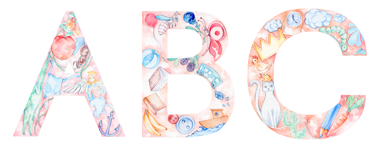
The newest illustration project I've finished is this alphabet for children, painted in watercolors.

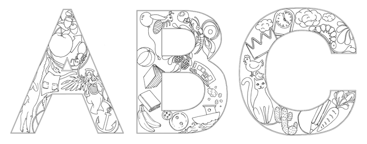
It consisted of both a color and a black and white version of each letter of the alphabet, and was generally a lot of work (relaxing work, but anyway...)

It's to be used in a school setting to be colored in and to form words, respectively.

As always, I like the 'handmade' look of my work, so I decided against using an existing font as a base for the letters, and instead started with constructing the individual letters from scratch.

Then I sketched in the animals and objects starting with the letter in question.

CUE UGLY SKETCHES!


... it could only go upwards from there.

Some letters were easy to do, providing a variety of cute and easily recognizable objects to be filled with.

Some were ridiculously hard to fill, though. Words with Q, anyone? How to draw a 'Quilt' in black and white? Will any child even know what a 'Zither' is?

That up there in the right corner is one.

Painting the individual letters of the alphabet:

The quilt made it due to Q not offering all that much else.
The queen is one of my overall favorites, though!
Anyway, indecision and sketching woes passed by, and I went on to color all 26 drawings.

I left the pencil line art visible to provide some contrast and started layering watercolors. Every letter of the alphabet has a slightly different background color forming an overall 'rainbow' gradation effect if all the letters are placed in order of the alphabet next to each other. The colors of the objects and animals inside were adjusted to look harmonious within that base color.

'O' is slightly more greenish in its background color...

... than the following letter 'P'.
Coloring was actually a lot of fun, despite the huge amount of illustrations to be finished in a relatively short time.

As the format was A3 I had some space for mistakes which wouldn't be visible later when printed, so I didn't have to whip out my smallest brushes for the most part.

At the end I went over all the illustrations with my pencil once more to make the outlines stronger.

The cleaning up in Photoshop was a whole other story, though...

The black and white versions were actually more work!

I drew them on the back of the watercolor illustrations using my light table to see the original lines and tracing those with multiliner pens. (to save paper and trees! :D)

As there were a lot of curves involved in some of the letters - and my hand wasn't steady enough - I had to do a lot of the precision work digitally.


The finished alphabet is already in use and I'll print some sets for myself - my nephew is already learning how to write in English (Korean pre-schoolers....) and these as A5 sized cards made a nice and practical present.

The color versions of these alphabet letters are available in my Etsy shop as a printable pdf file. The pdf consists of 13 pages with two letters each, so they're easily transformed into cards. Just print on a nice, heavier paper (I'd recommend 200g and upwards), cut the paper in half and there you go, 26 individual cards to arrange into name signs, wall art and of course to teach the letters of the alphabet for early (English) learners!

Thanks for reading!

Watercolor Illustration Alphabet - Hand Drawn Printable ABC cards, nursery decor, wall art, etsy evydraws


9 August 2015

ILLUSTRATION PROJECT - Illustrations for a Children's Picture Book!

I'd like to introduce a new 'Illustration Project'! (Wow, it's been a while...)


Over the last two months I've worked with the author Nicola Gothard on illustrating her children's picture book story 'The Rubbish Dump Whale'.
The story focuses on animals living in one of the - very real - garbage patches which are present in every ocean on this planet. It shows the struggle of three animals trying to change their oceans for the better and even teaches some lessons on how to minimize ocean pollution at the end of the book.

It is also incredibly cute. ;)

So, in this 'Illustration Project' blog post, I'll show you some of the final illustrations as well as sketches and different stages of the drawings. Let's call this a 'Making Of' post.

If you like what you see, you can order the book on amazon. There's both an ebook and a print version (print version link coming soon!).

More information can be found on the generation2050project website, too!


Now, on to the actual illustrations!

I did some character sketches first.


As the story takes place under water, watercolors were the perfect match. The textures created in watercolor would give a playful water effect fitting a children's picture book.

Then we started with sketches based on the pre-written story.


My sketches are ridiculously bad. I'm still surprised the author could actually guess what the finished illustrations would look like. 

After having all 20+ pages approved, I started working on detailed pencil drawings.

Some of those were kept rather simple to leave space for text and to focus on the animals themselves...


On other pages we wanted to really put the focus on the actual pollution, so the pieces of rubbish had to be very detailed and 'swallow' the whale swimming among them.


These pencil drawings were then colored in.

I used a kneadable eraser to make the pencil lines less prominent and combined that with a small eraser to keep the lines crisp and precise.

No, I didn't use the Micron pens, of course. 
The eraser pen on top was used, as well as the brushes. 

I kind of always use the same materials. I'm boring (and stingy) like that.

As for the watercolors themselves, you can have a look at my watercolor swatches and review fest here

First interior illustration of the book, introducing the whale and his 'home'.

Some of the watercolor blotches (?) were created seperately and then layered on top of the illustrations in Photoshop. This made for more vibrant color effects and for more flexibility when it came to layouting, as I was able to move parts of each illustration around independently.
Water bubble effects - I made like ten sheets of these.
 (If anyone's interested, I could offer some of these as Photoshop patterns or brushes.)

Definite improvement over the initital sketch. I hope.

You can have a look at the illustrations on my portfolio site, too!


For some of the illustrations I added text effects. Like the water bubbles I drew all letters on a seperate page and arranged them in Photoshop.

Love to hate the derpy expression in this sketch. 

From sketch...


... to drawing ...

... to finished illustration.


Like I'd mentioned, there were also some tips and reminders on reducing pollution at the end of the book, which we presented in the form of letters from the animals to humans. This also required some additional illustrations to make the texts more visually appealing.


All in all I really like the result and I'm looking forward to holding a printed version in my hands! (it's on its way, but well, Korea and the UK aren't exactly next-door neighbours.) I'll force the book on my little nephew who's already studying English in Kindergarden...

Ocean pollution is a major problem, but also an often overlooked one. I'm happy to have contributed some small illustrations to, hopefully, raise awareness. And I'd be even happier if you could share this post or the book so it can reach a wider audience!

Thank you!